
There’s this two-floor building which I often visit with an elevator interface that is way too complex:

Seriously, why does it need five buttons?
First of all, the “Close doors” button is a lie. It is also unnecessary to have two buttons to choose from when there’s only one way to go.

The useful action must take up more area than the extras:

But that’s still not enough. The elevator has a scale built in, so it won’t go when too crowded. This scale can be used for another feature, human presence detection. As soon as the elevator detects that weight isn’t changing, it shuts the doors and goes. A screen can be used to make the elevator more informative.
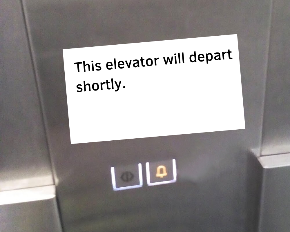
Therefore, the only buttons needed in an elevator are those for emergencies like getting stuck inside or in-between the doors.
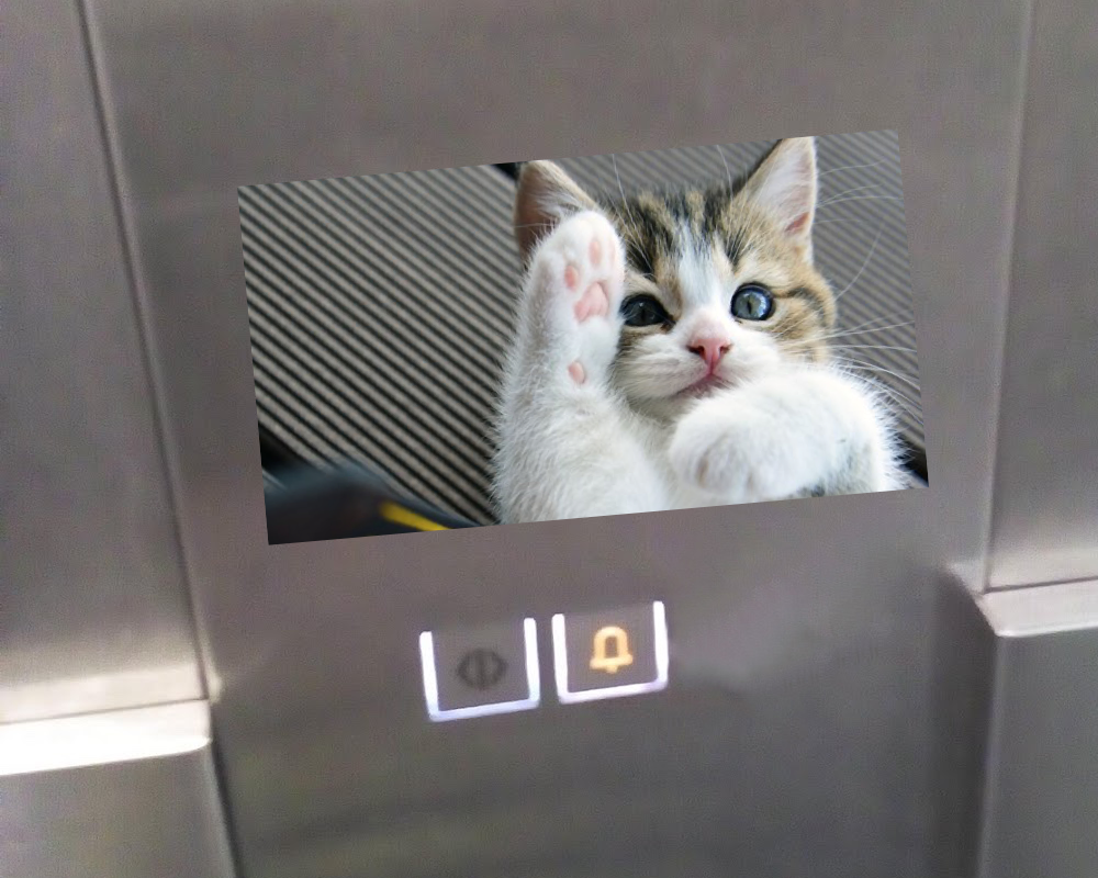
The only problem that remains is the waste of time that the elevator is. Sure, you save time and energy by using it instead of a staircase, but the ride could be much more pleasant. A 10-second cat video will solve everything.
A game show would be even better, but the journey here is way too short for that.