
“Nel Segno di Bacco” is an Italian artistic group touring the country with a musical play about wine, food, and conviviality.
Its founder Guido Damiani hired me to create an online presentation for potential collaborators and venues. Thus, I built a website:

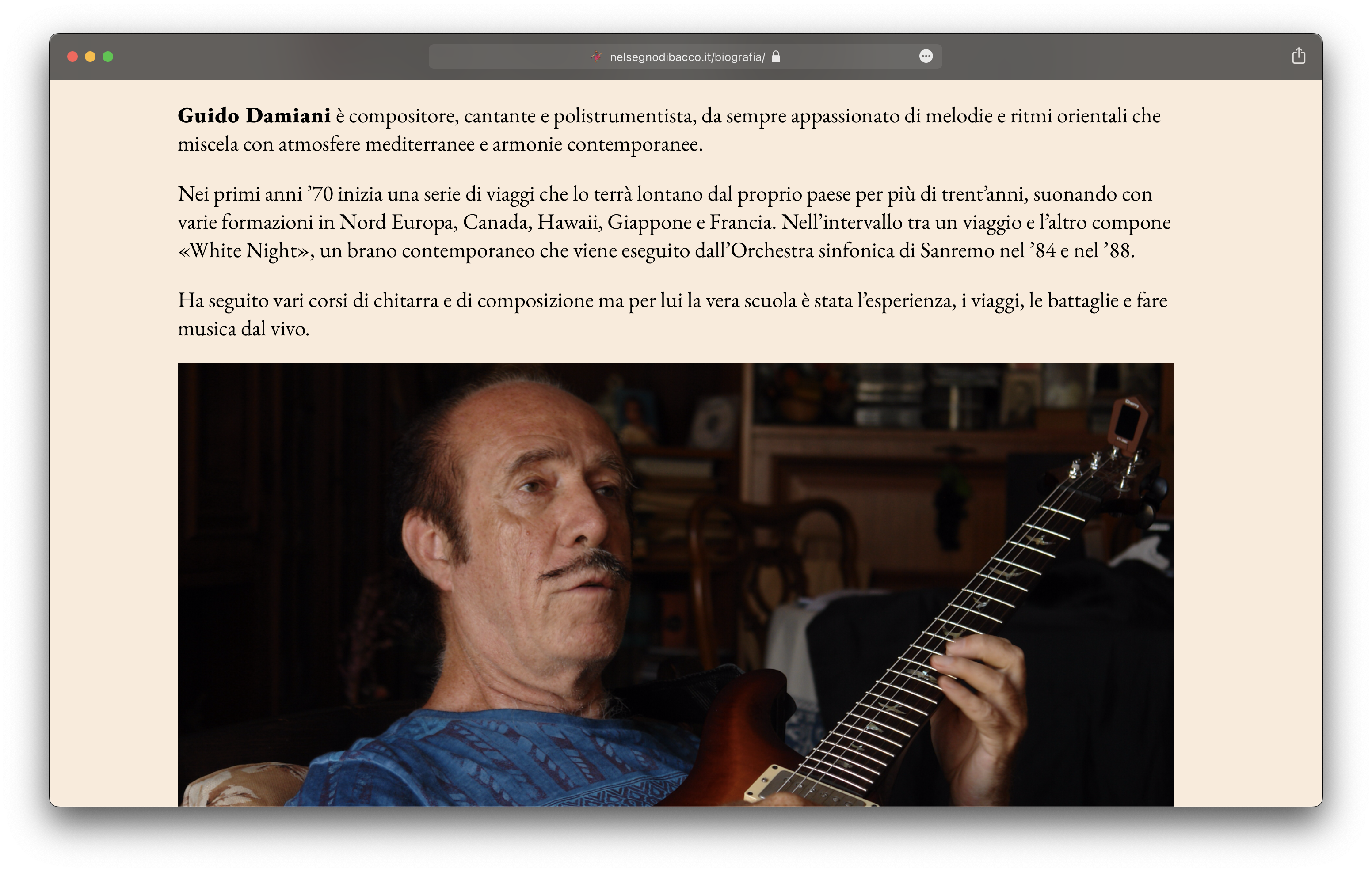
The client
Guido is a philosopher musician whose principles and thoughts resonate with me. One of the things that he told me really struck a chord: “The voice is the most melodic instrument out there. But it is only when the words go unrecognised that a person can fully appreciate its tune”. That’s why most of his singing is similar to the shamanic eaoeaueao. Overall, his music is a fusion between the primitive, Amazonian, Oriental, Mediterranean, and contemporary; I recommend giving it a listen.
Process
As well as presenting the group, the website hosts its music and Guido’s notes — previously emails sent to friends.
I started work on December 27 with the deadline of January 31, and completed it early, by January 15. This included renting the domain name and server space, setting them up, designing and developing the site, and correcting his notes typographically.
Guido gave me lots of material to work with, but told me that he did not want to overflow the site with information, and even said that the presentation should underpromise.
Step-by-step we nailed it down to what matters most. Event descriptions addressed to each kind of venue were axed in favor of a general overview and a manifest. I first placed an image gallery on the Events page, but figured even that would be excessive.

This structure will change with time, however: as “Nel Segno di Bacco” holds more events, it will make sense to fill up the website with many diverse pictures, videos, and reviews.
Art, wine, food, conviviality — the most important things to know — are up top. Right below them is the promo video — a visual event is best seen to be best understood:
The details follow. Events, Bio, and Music pages all consistently have text followed by a photo and contact details.
I chose to use the elegant typeface Garamond, as it is a default for Italian books. Its case was only made stronger when I discovered that it was already used in some older promotional materials. I chose Inter for places where a serif was not appropriate — mostly in auxiliary elements of the Notes section:

Premium brands opt for a monochrome look. I chose a pleasant sandy tone as the site’s background color, and used black for everything but the links. The large margins too convey a sense of class.
Special thanks to Daniil Chernyak for providing useful tips.
Result
Instead of sending back-and-forth messages about the group, its members can now simply share a link to its website. Guido’s brilliant music and notes are now available for the public to enjoy.
And now, Guido’s review:
In the work that we did, Robert worked very well & very quickly, and was very prepared. Most importantly, Robert has a philosophical vision similar to mine, which is a great advantage for me. The website is fluid and smooth; clients will now be able to grasp our musical message and philosophical vision in little time.