The first step to civilisational downfall
Littering.
Loud noises in public transport.
Constant delays.
Broken promises.
Mass tolerance towards this kind of “minor” misconduct is the first step to civilisational downfall.

Home page · Design · Travel · Gear · На русском
Littering.
Loud noises in public transport.
Constant delays.
Broken promises.
Mass tolerance towards this kind of “minor” misconduct is the first step to civilisational downfall.
The innards of a traffic light button:

“Life doesn’t last all life. Life lasts while you’re young”:

Typography:
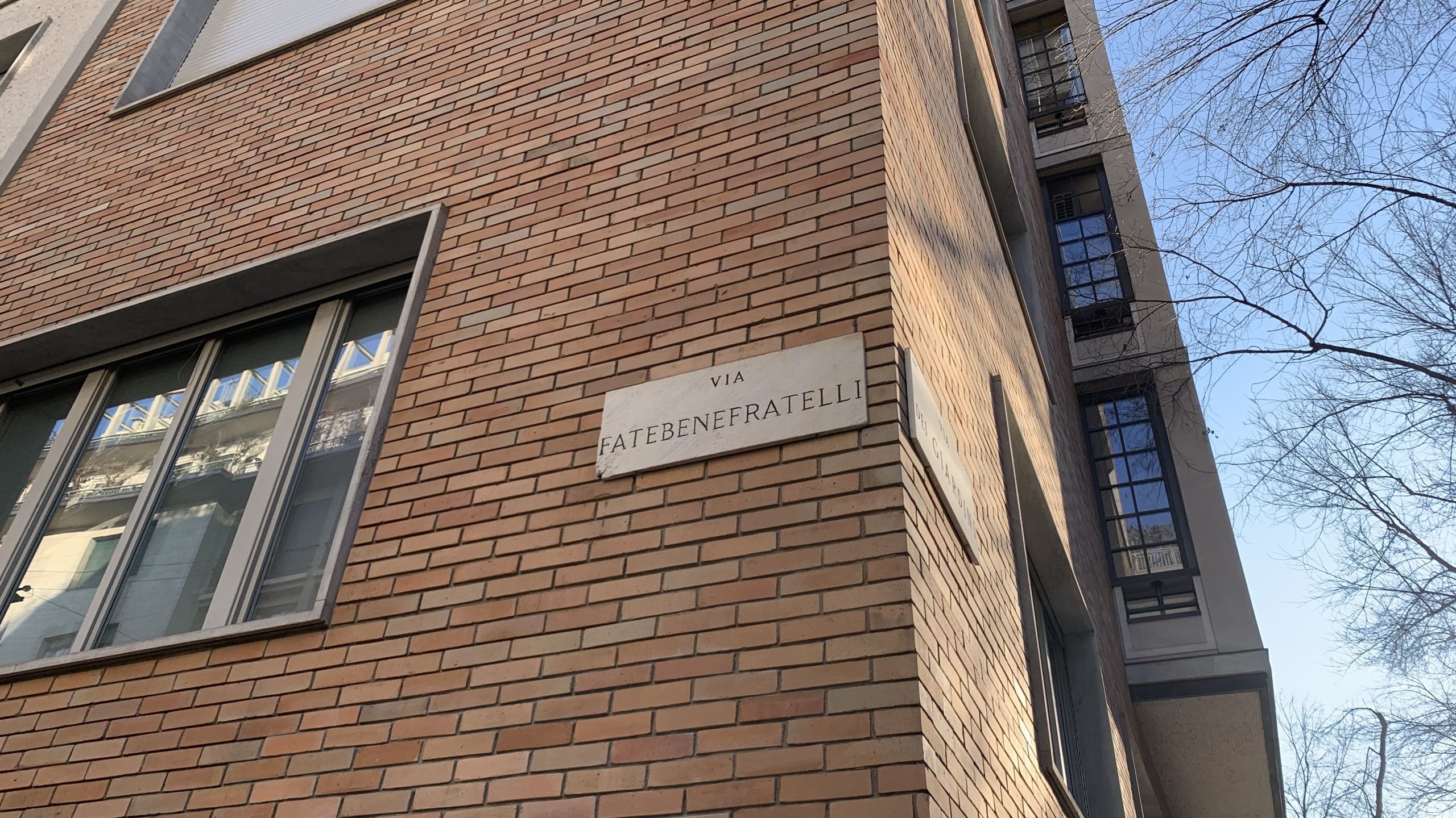
Plaques:
Posters:


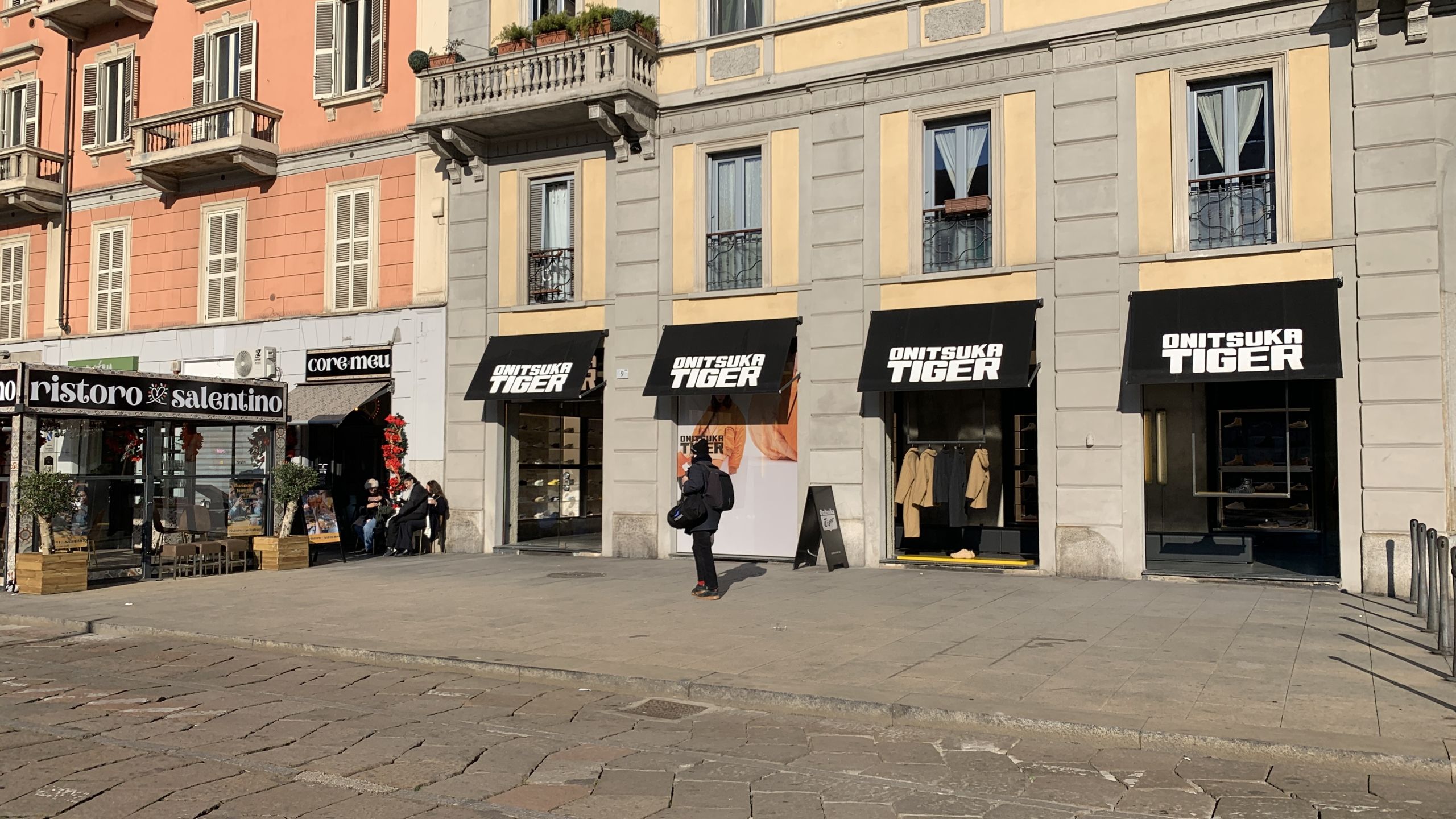
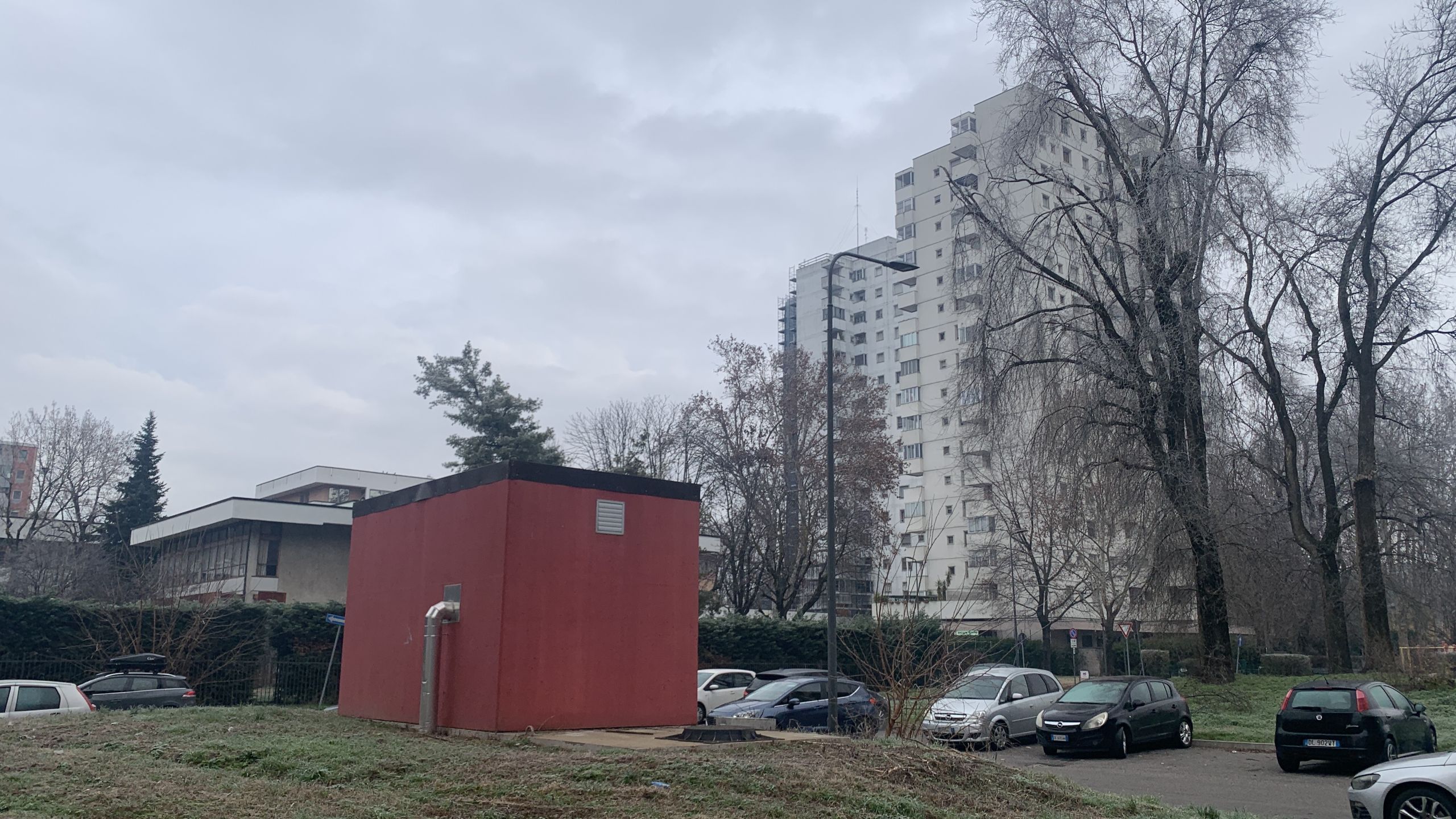
Greyness:
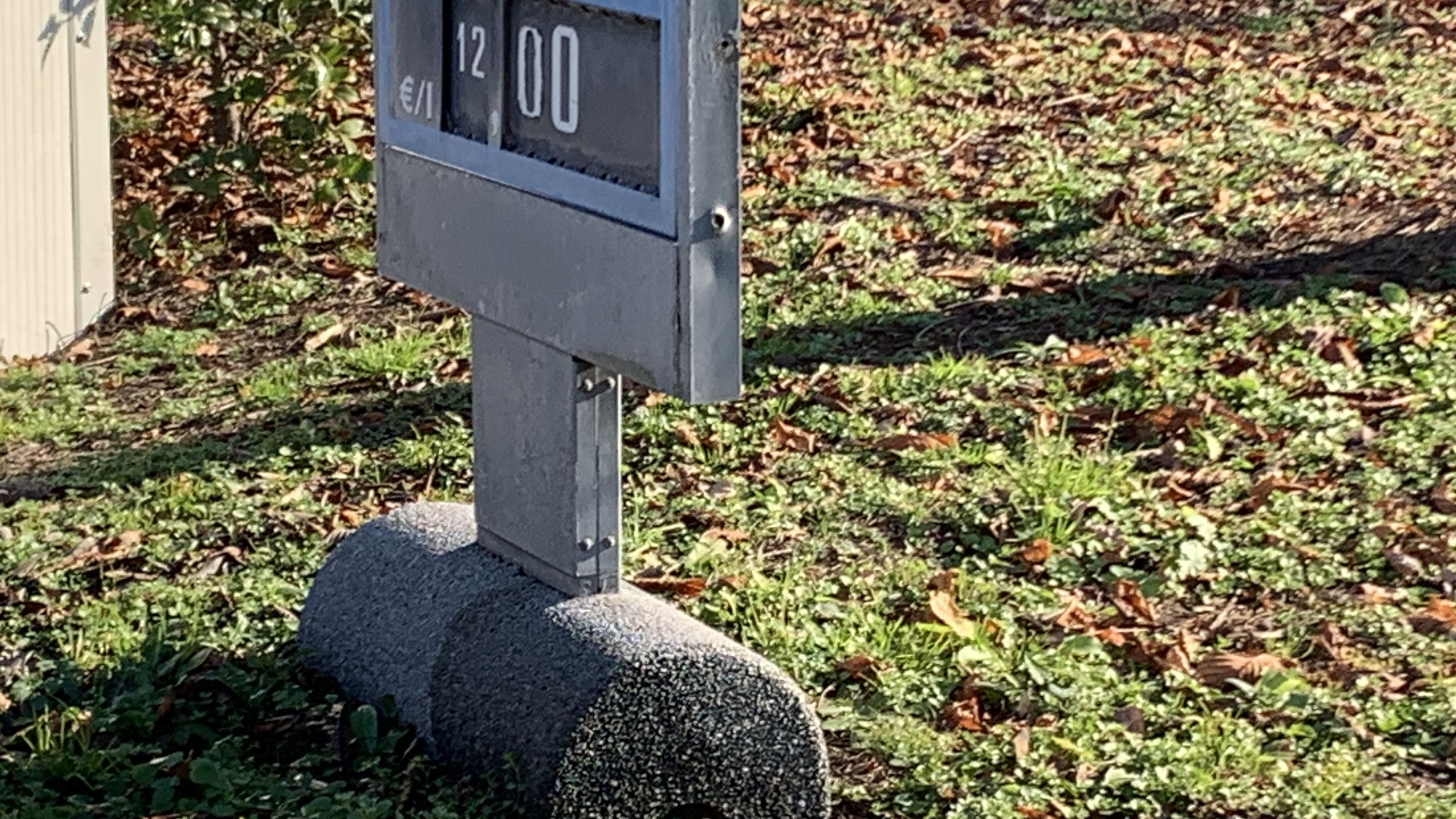
12 €/L petrol:
No comment:

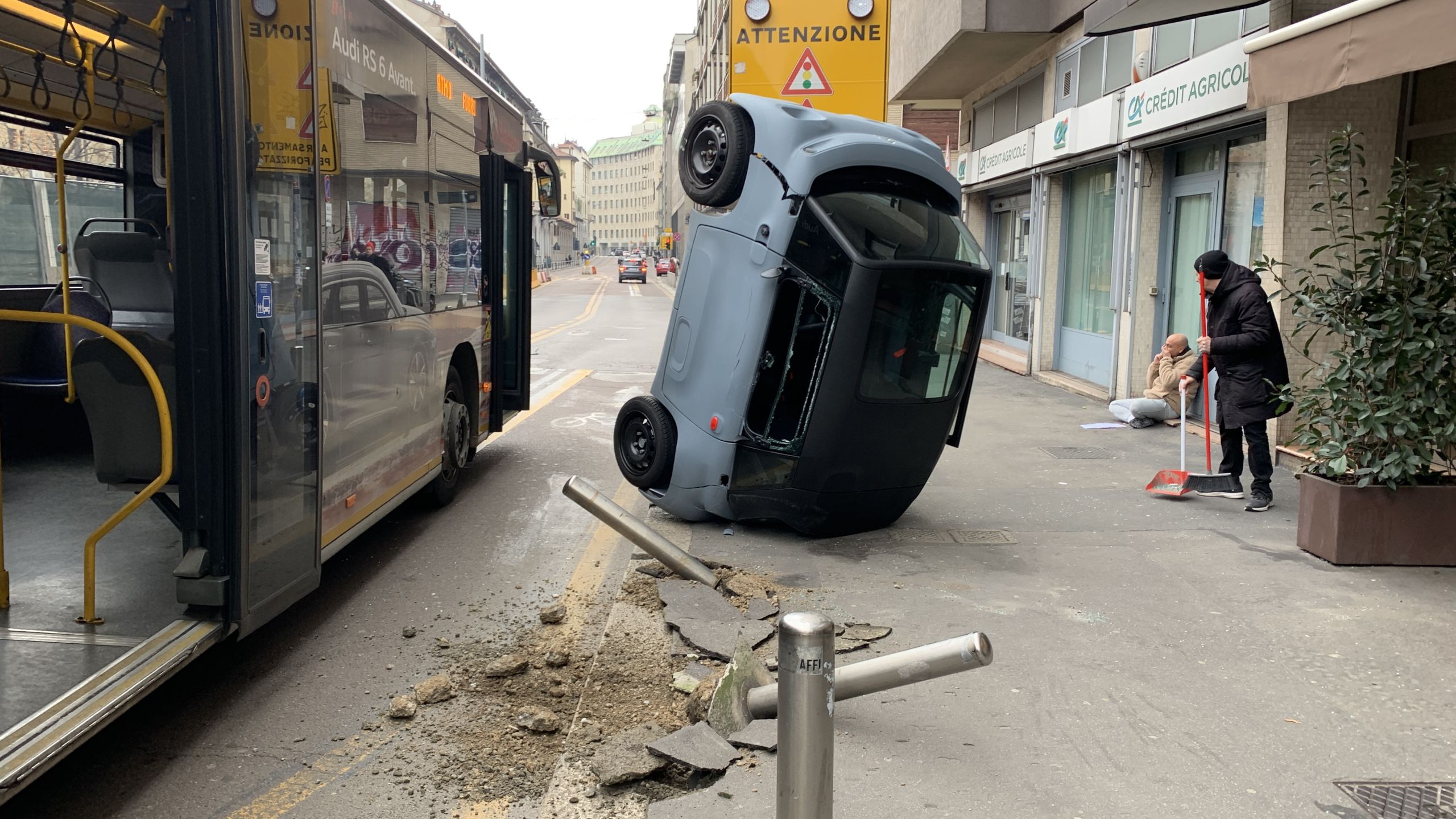
Shit happens:
Tunnels below, perchance?

Based:

Listen to your inner voice. It speaks truth.
French, Italian, Latin, Russian, and many other tongues draw the T–V distinction: the 2nd-person pronoun depends on courtesy, familiarity, and age.
But in English, we always say “you”. Simple and egalitarian! Perhaps this even begets opportunities: people aren’t needlessly distanced from one another.
Less than a month after changing trains at Mestre, I unexpectedly got to see the real deal: Venice proper.
It is a designer’s wonderland. It would also be the best city to live in (much beauty, no cars) if it wasn’t for the frequent flooding.
See the video I made for Ribis for the landmarks. This post contains the parts that didn’t make the cut.
A canal:

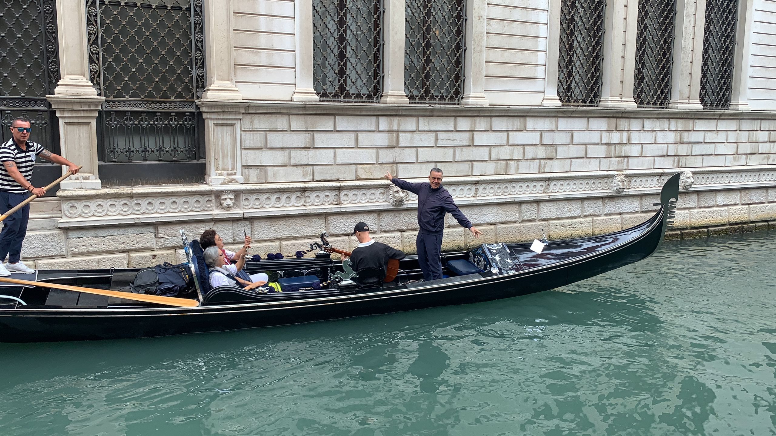
A singing gondolier:
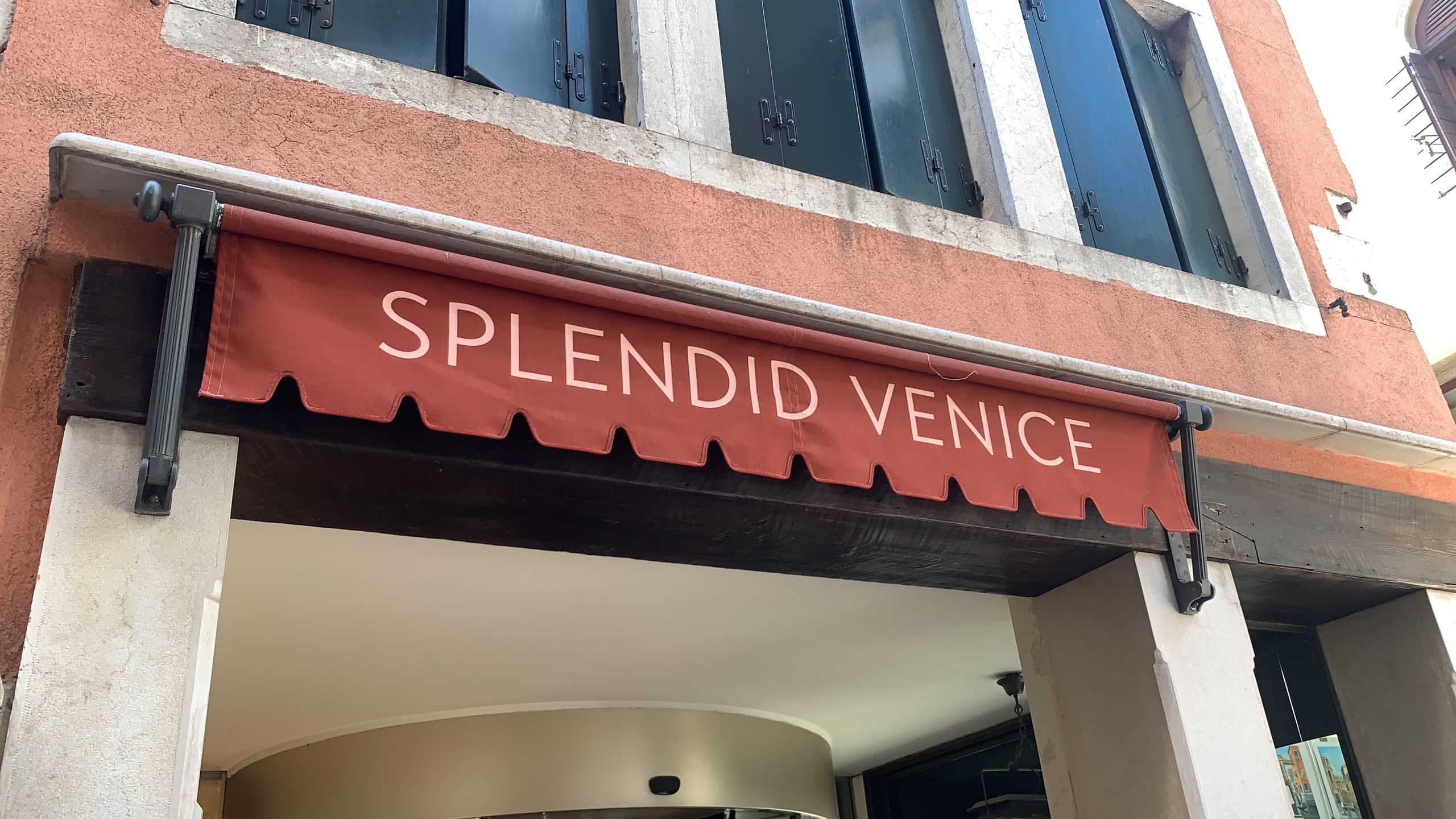
Splendid Venice:
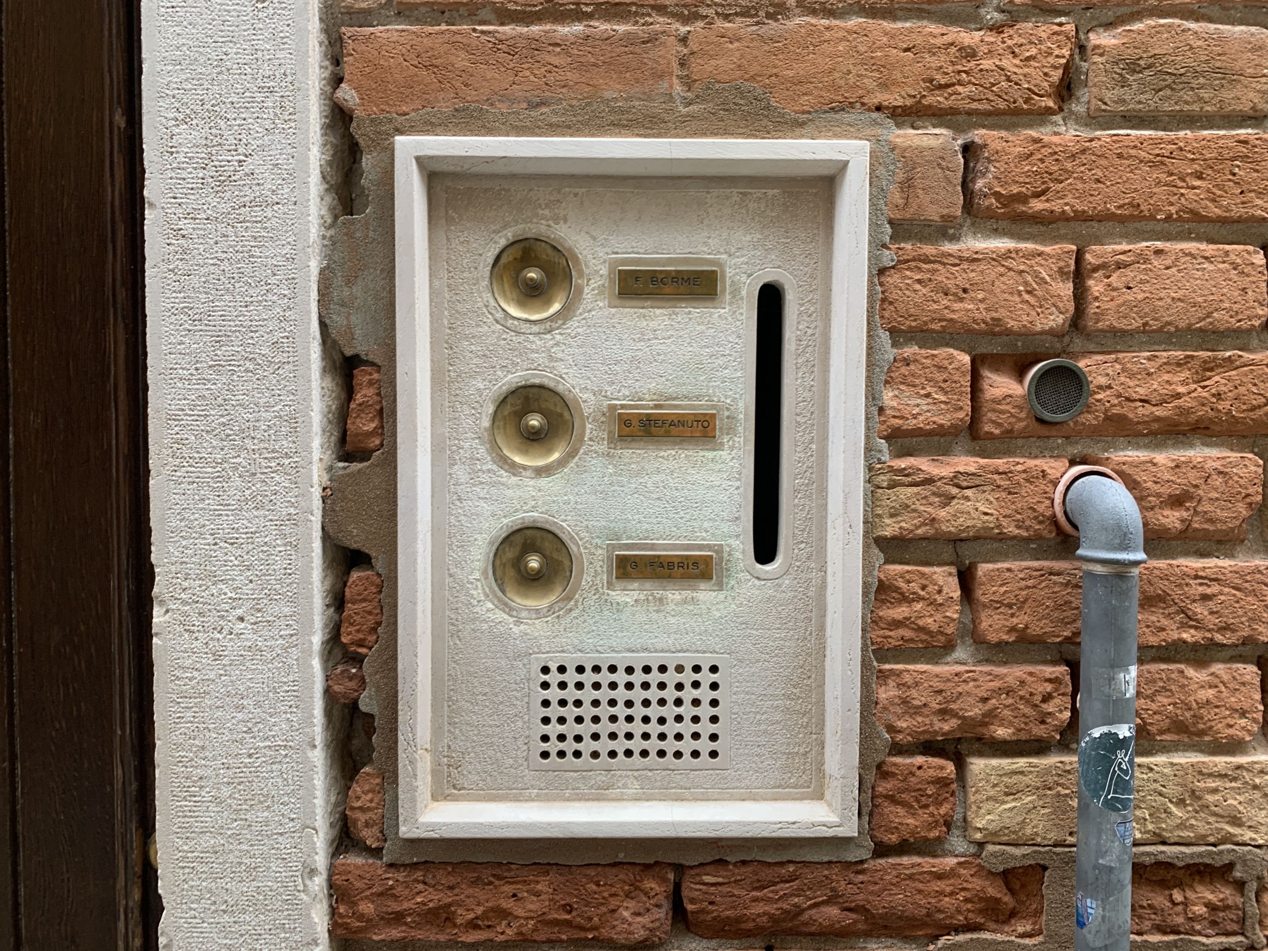
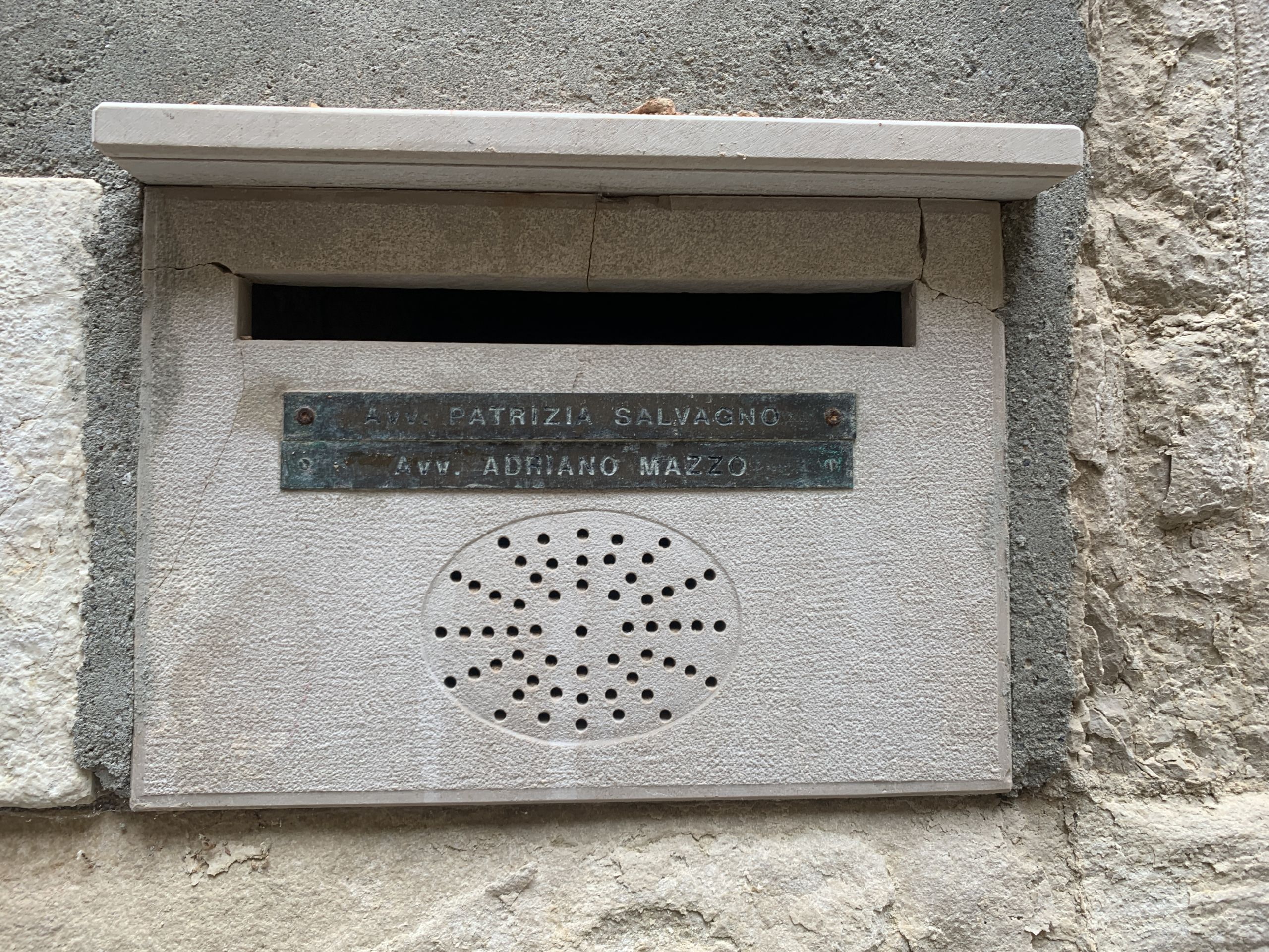
Intercoms combined with mailboxes:

Free Assange:

Colorful cube in Mestre:

Atkinson Hyperlegible is my default typeface for Latin-alphabet undertakings, including the Nice tramway map and some client work as well.
It does have an issue tho: the slashed zero actually makes text less legible in some cases. So I got rid of it in my modification:
First of all, the euphoric smell is still there. I didn’t find it as common as in 2020 and before, but it does come from the Tube and it also came from a bus. May it stay.
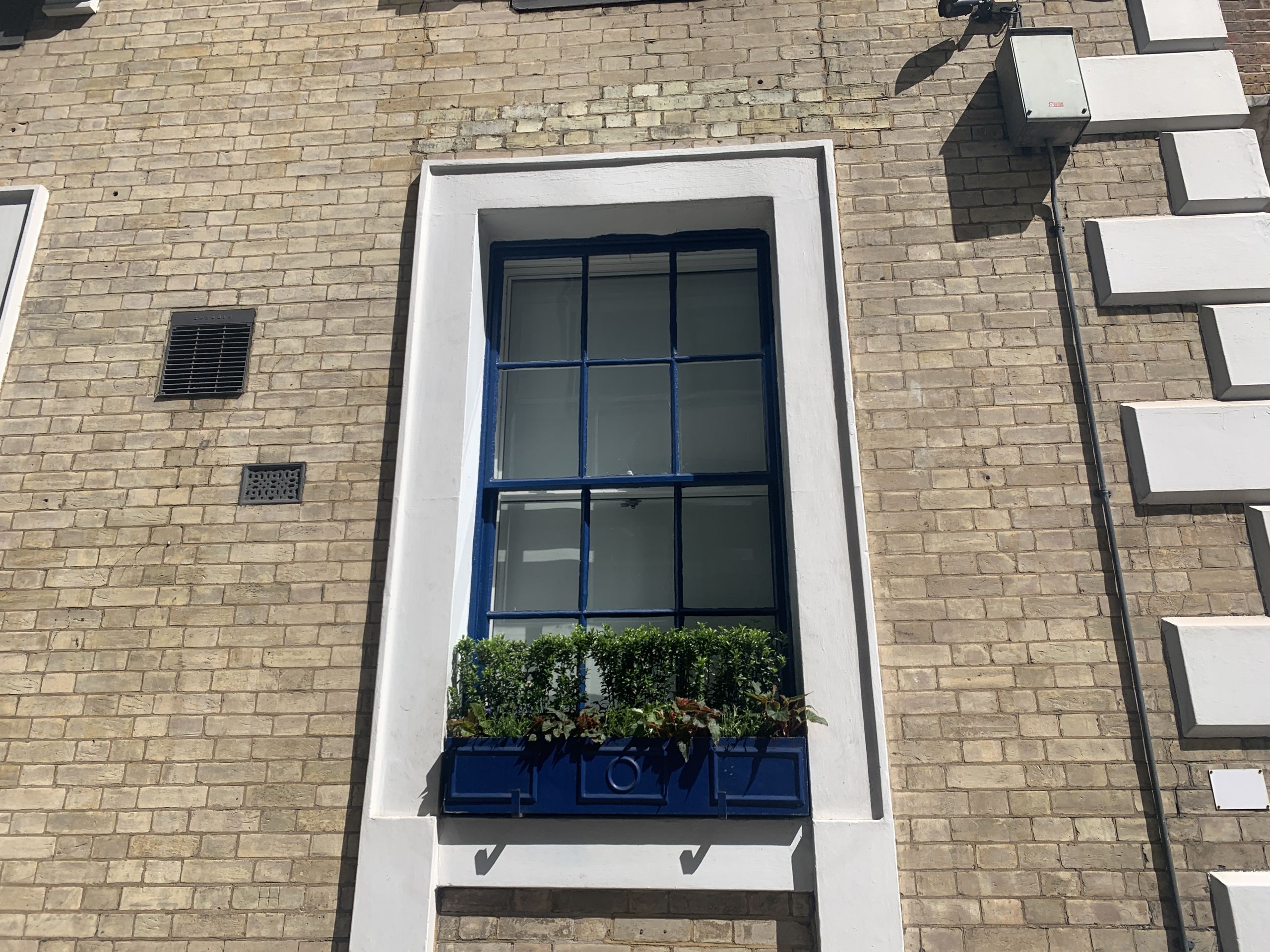
A beautiful window:
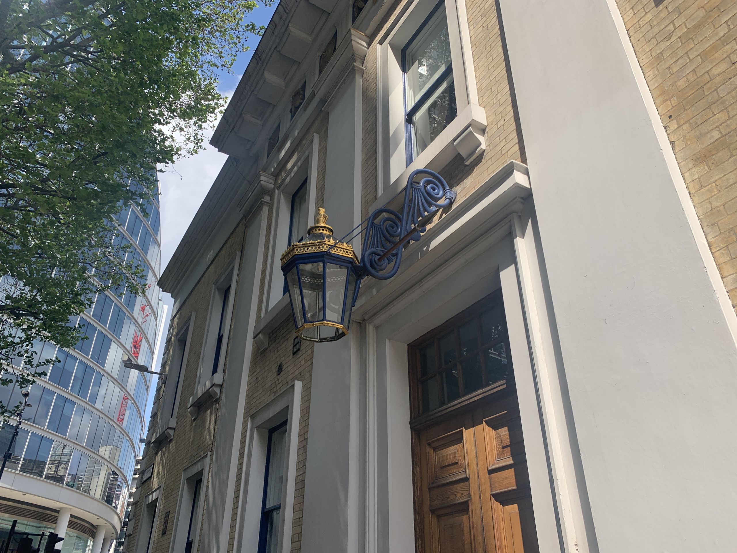
A beautiful lantern:
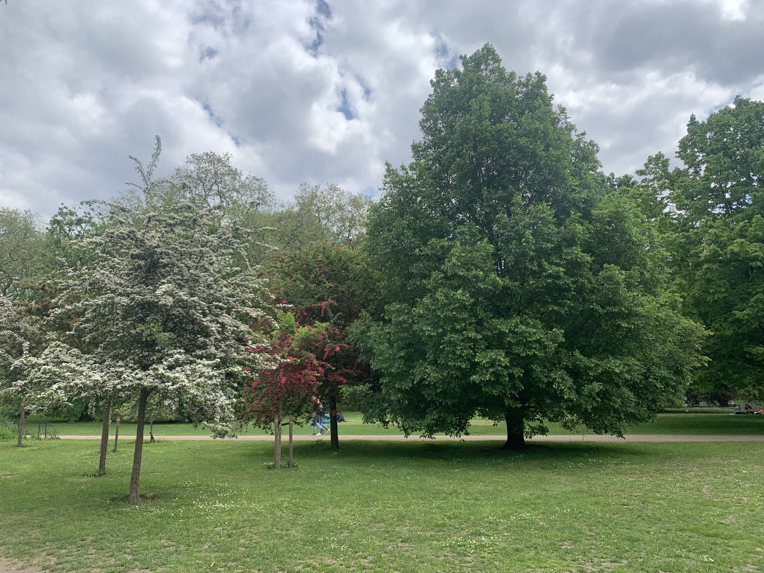
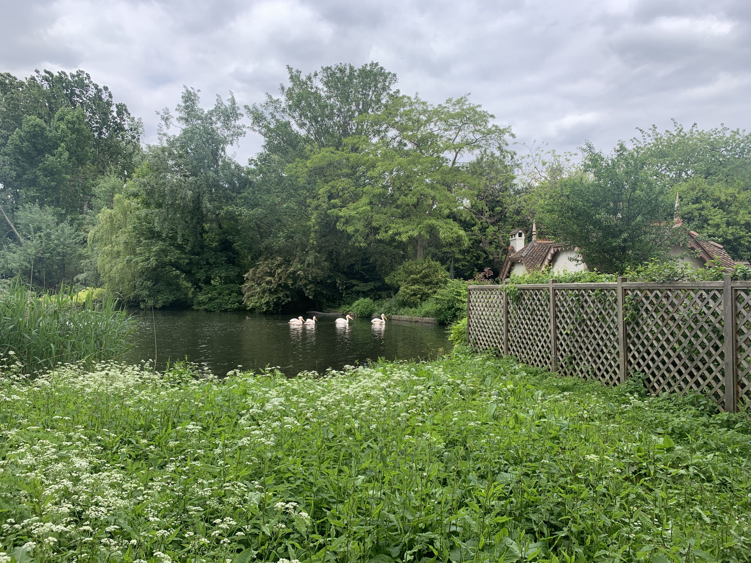
Greenery:

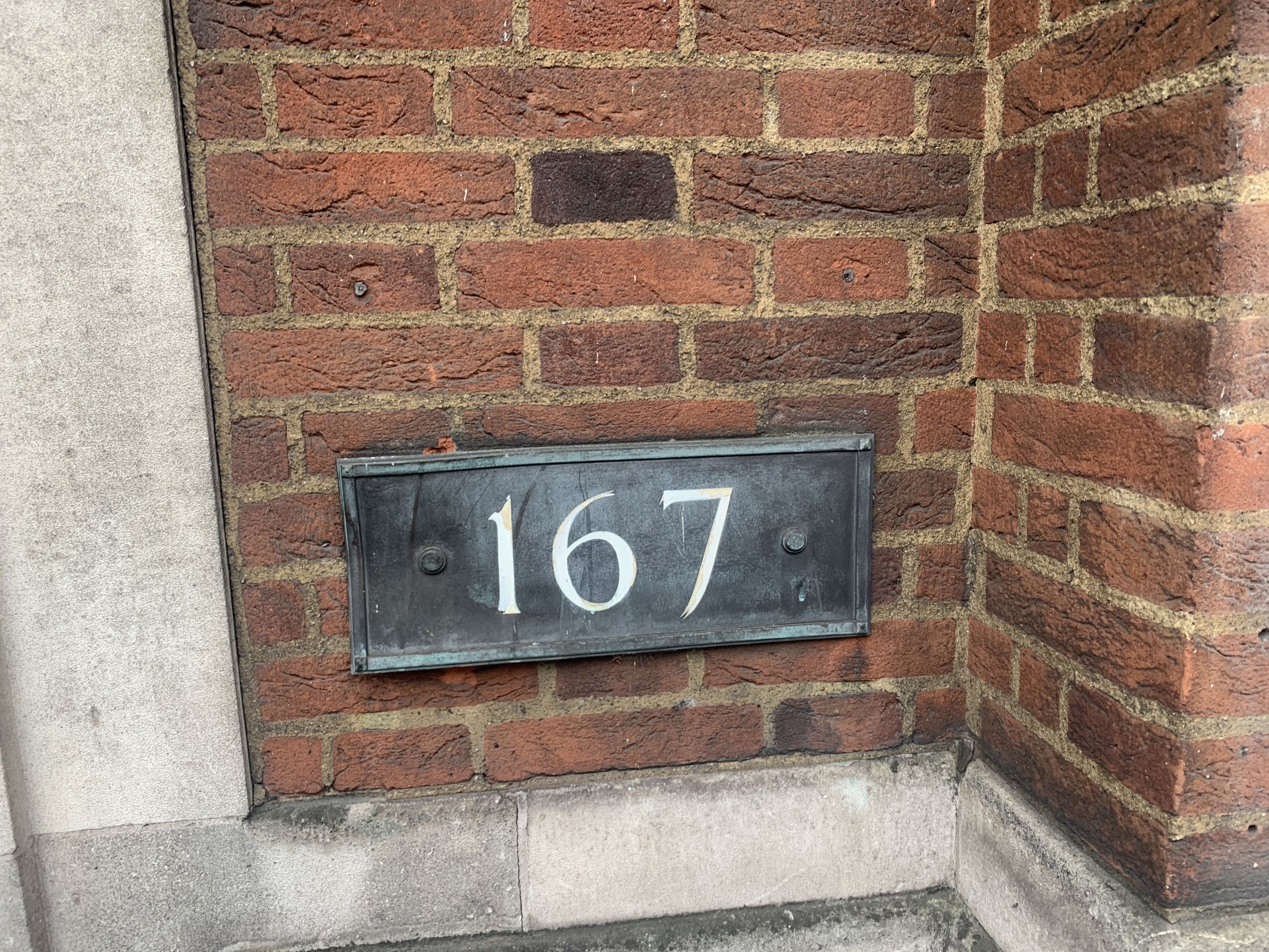
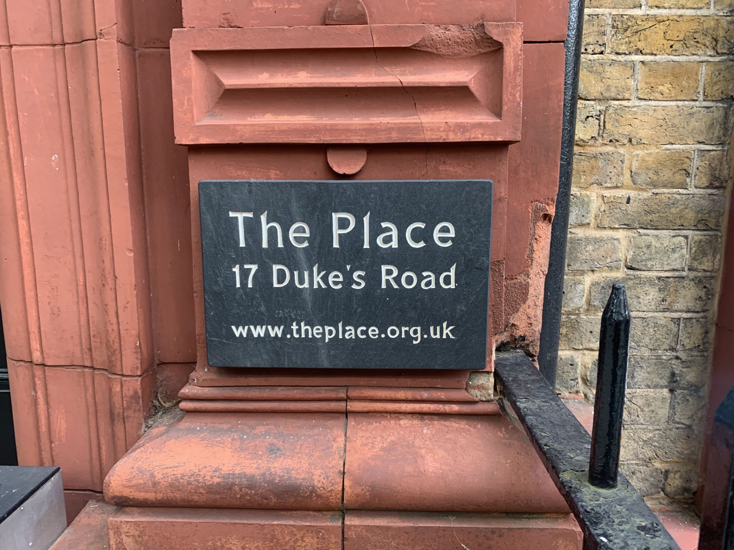
Plaques:
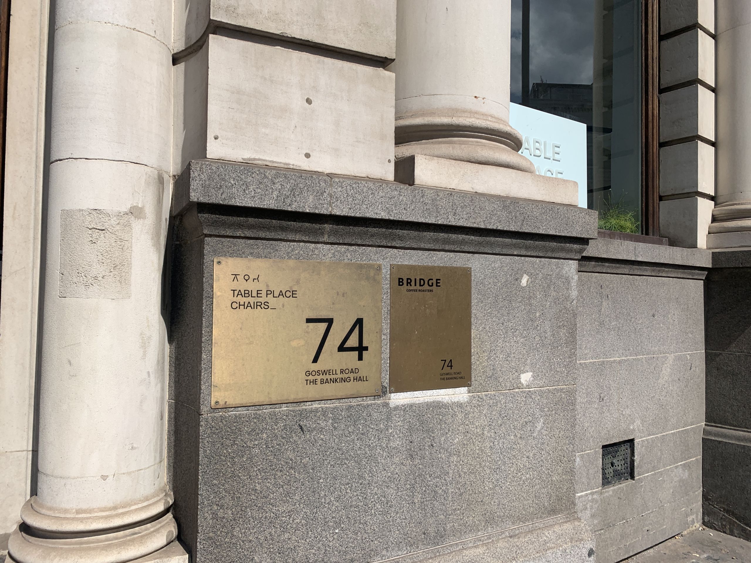

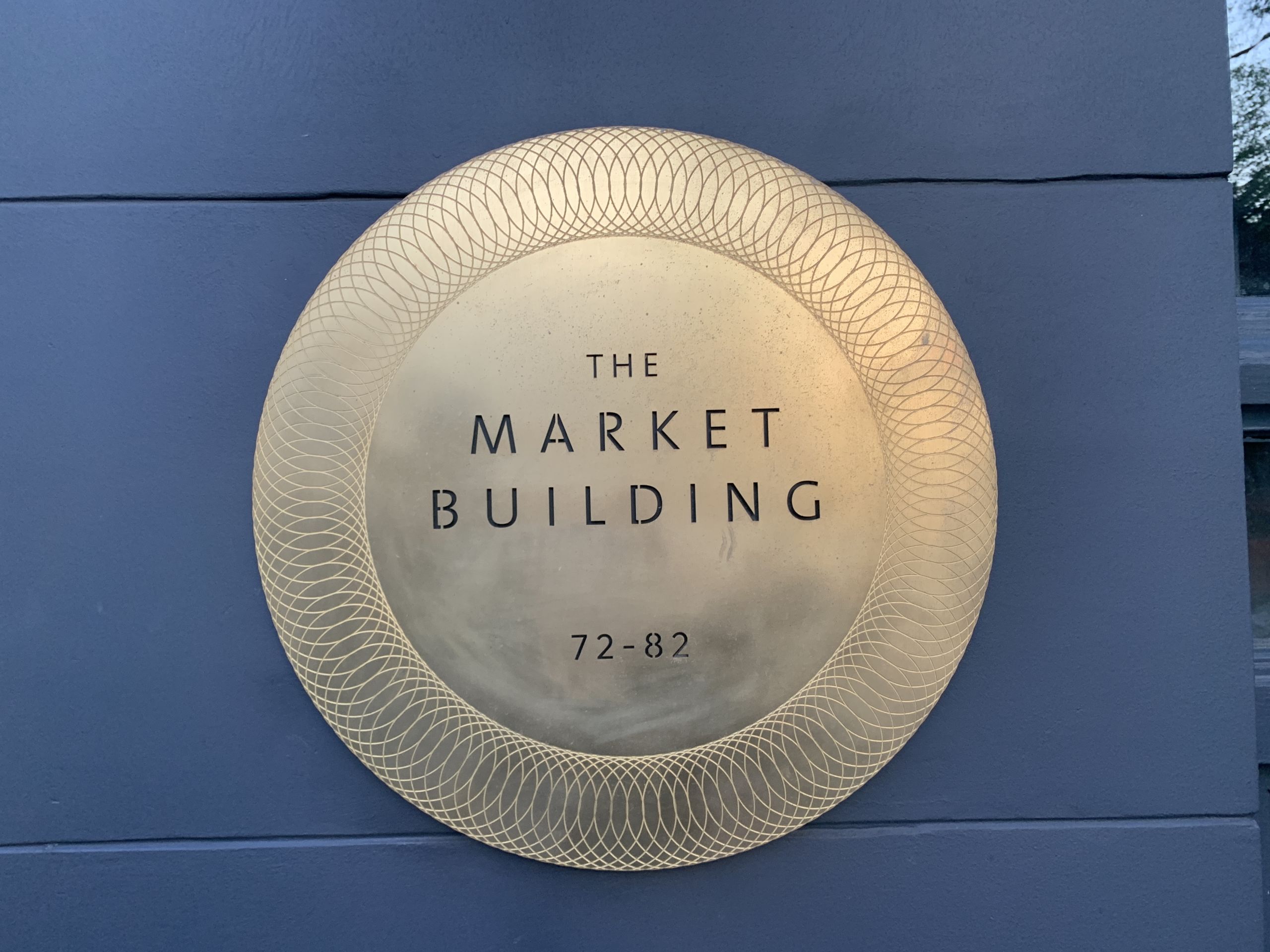

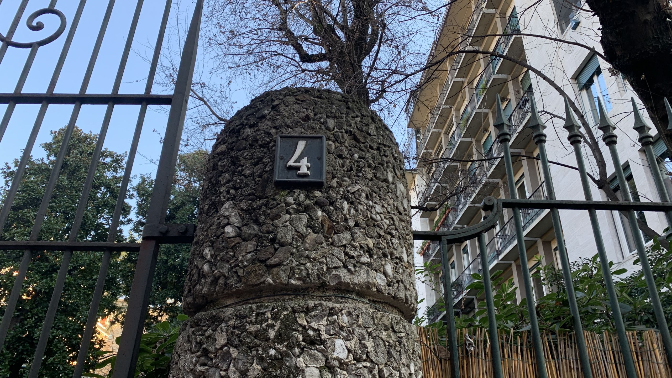
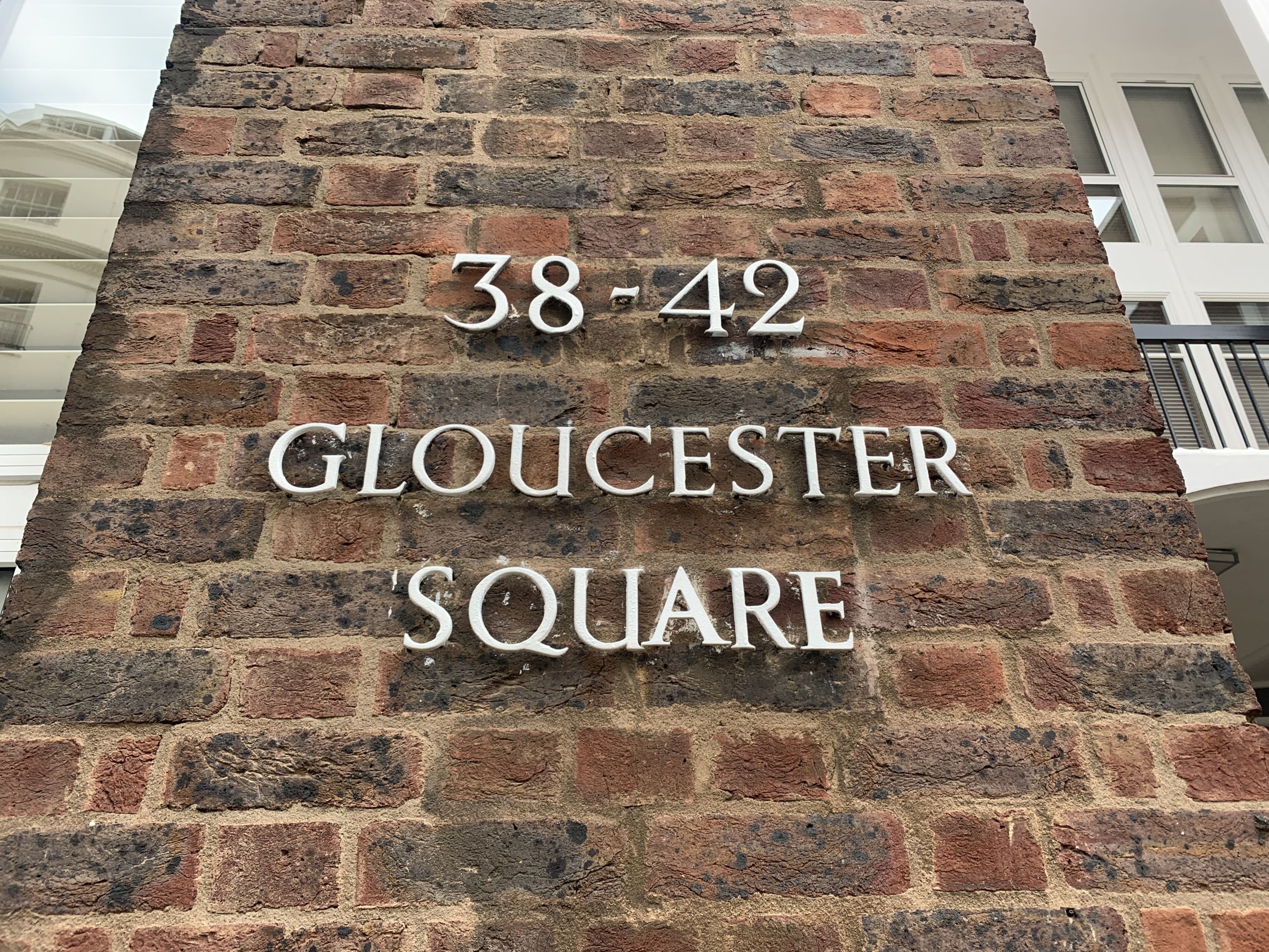
Other address lettering:

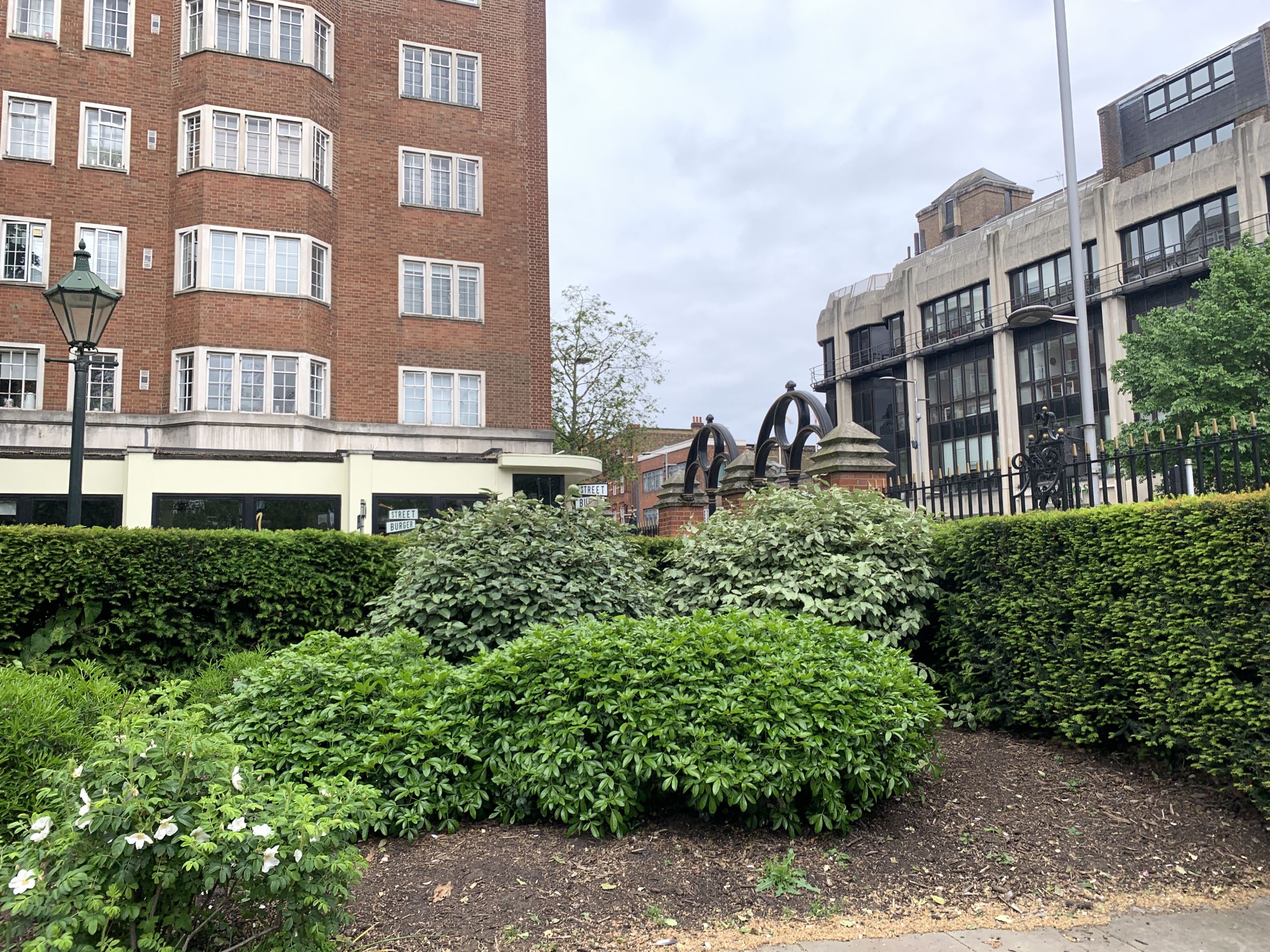
Soviet architecture:

A traffic light:

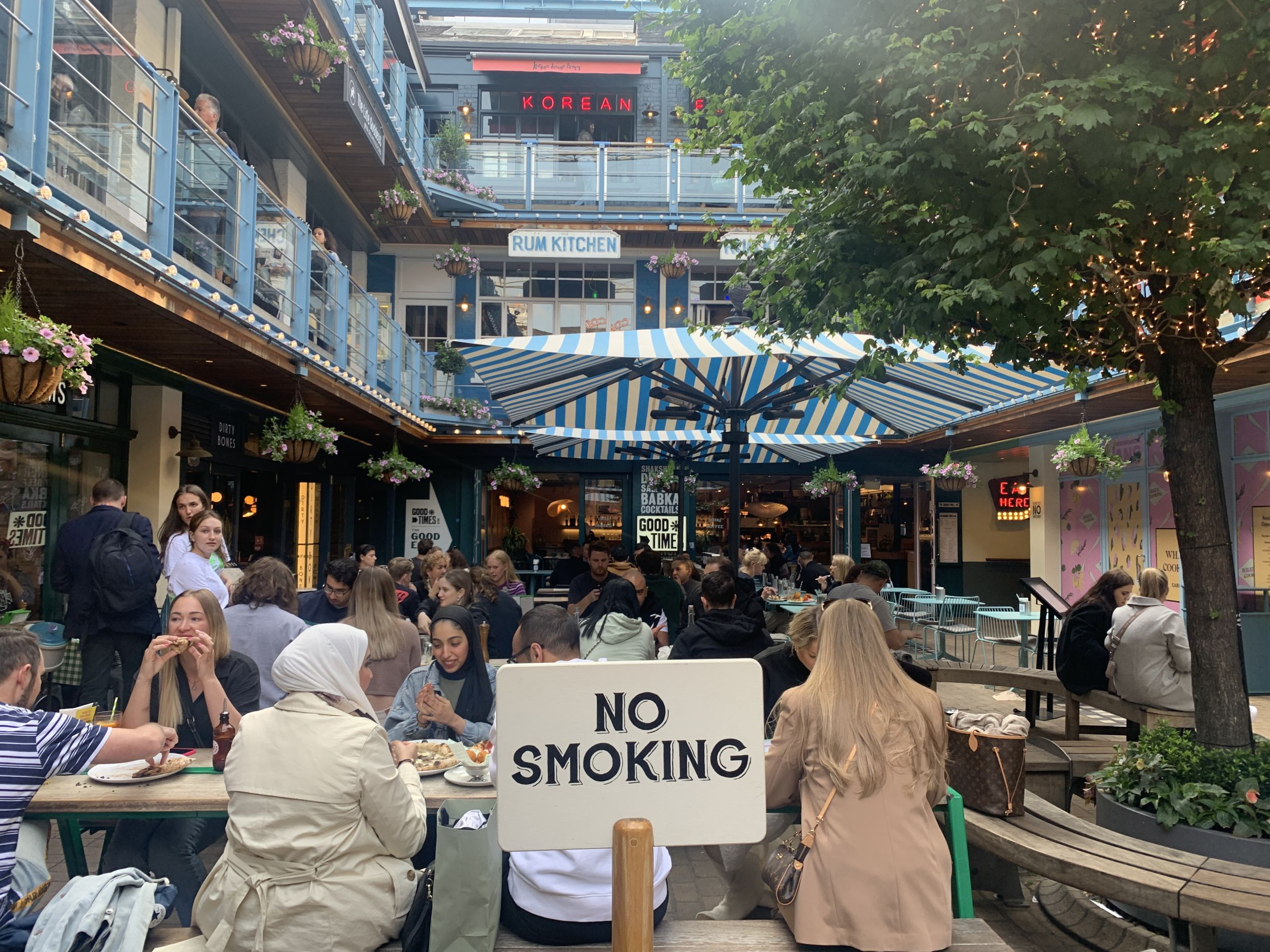
An outdoor table:

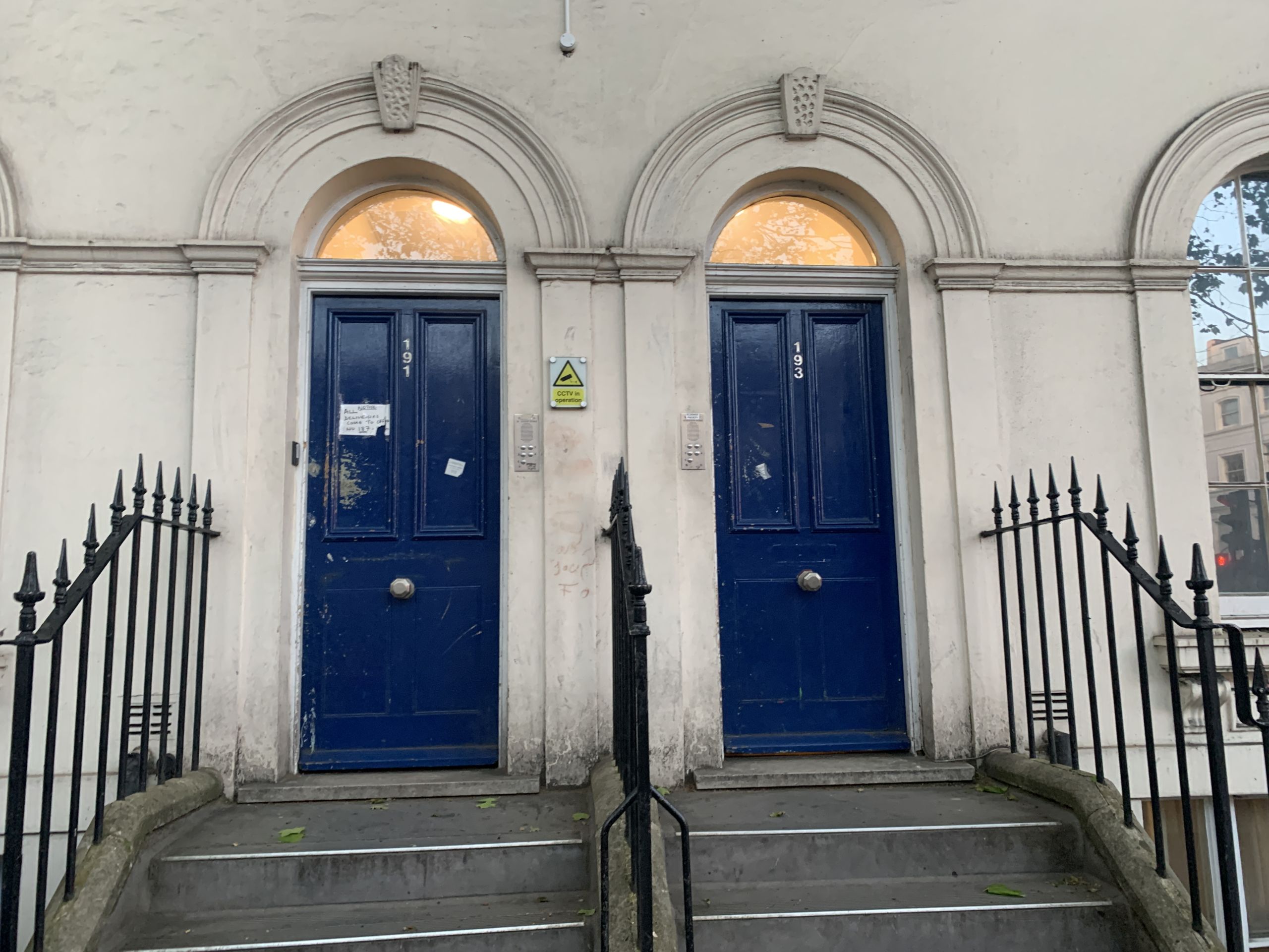
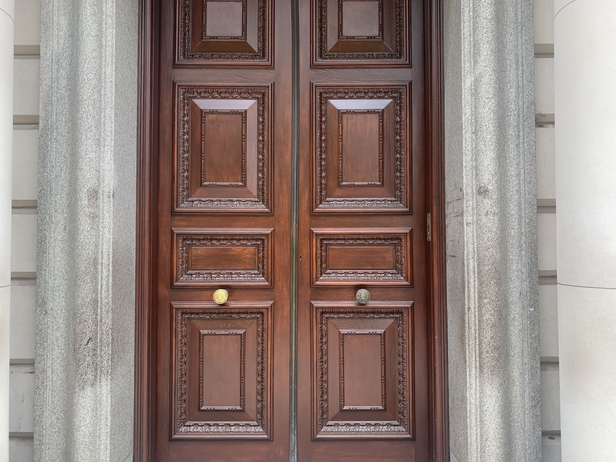
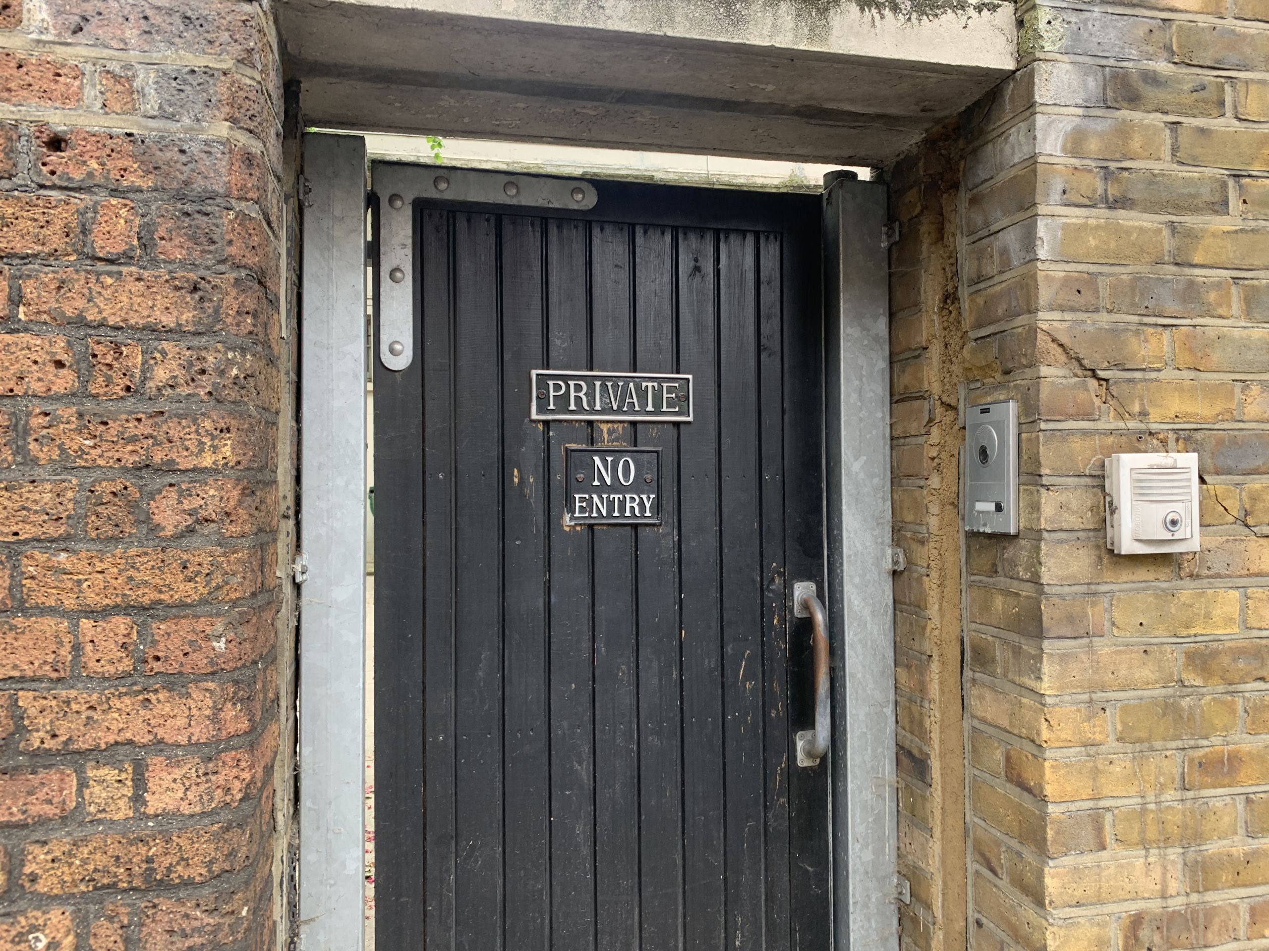
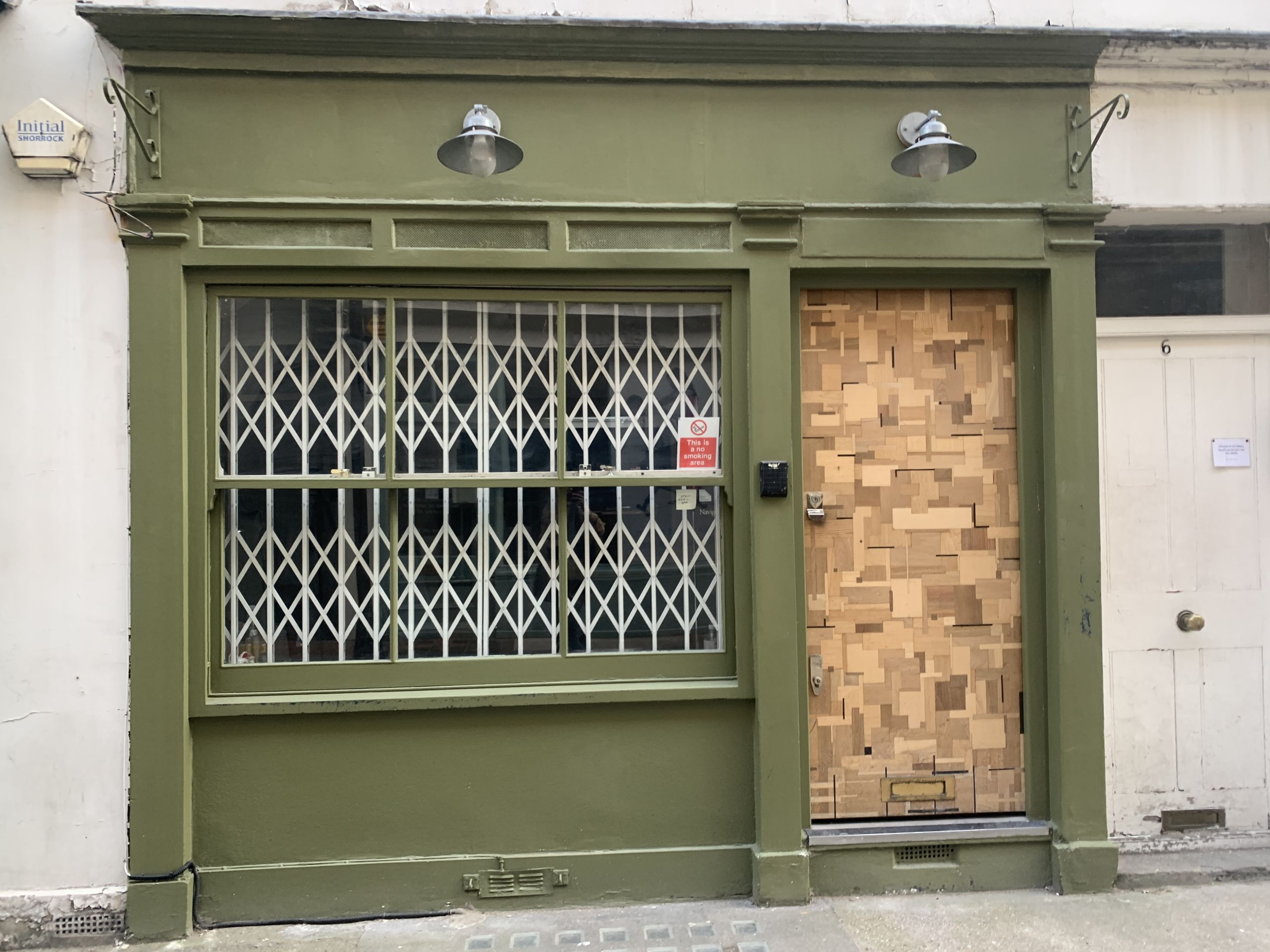
Doors:
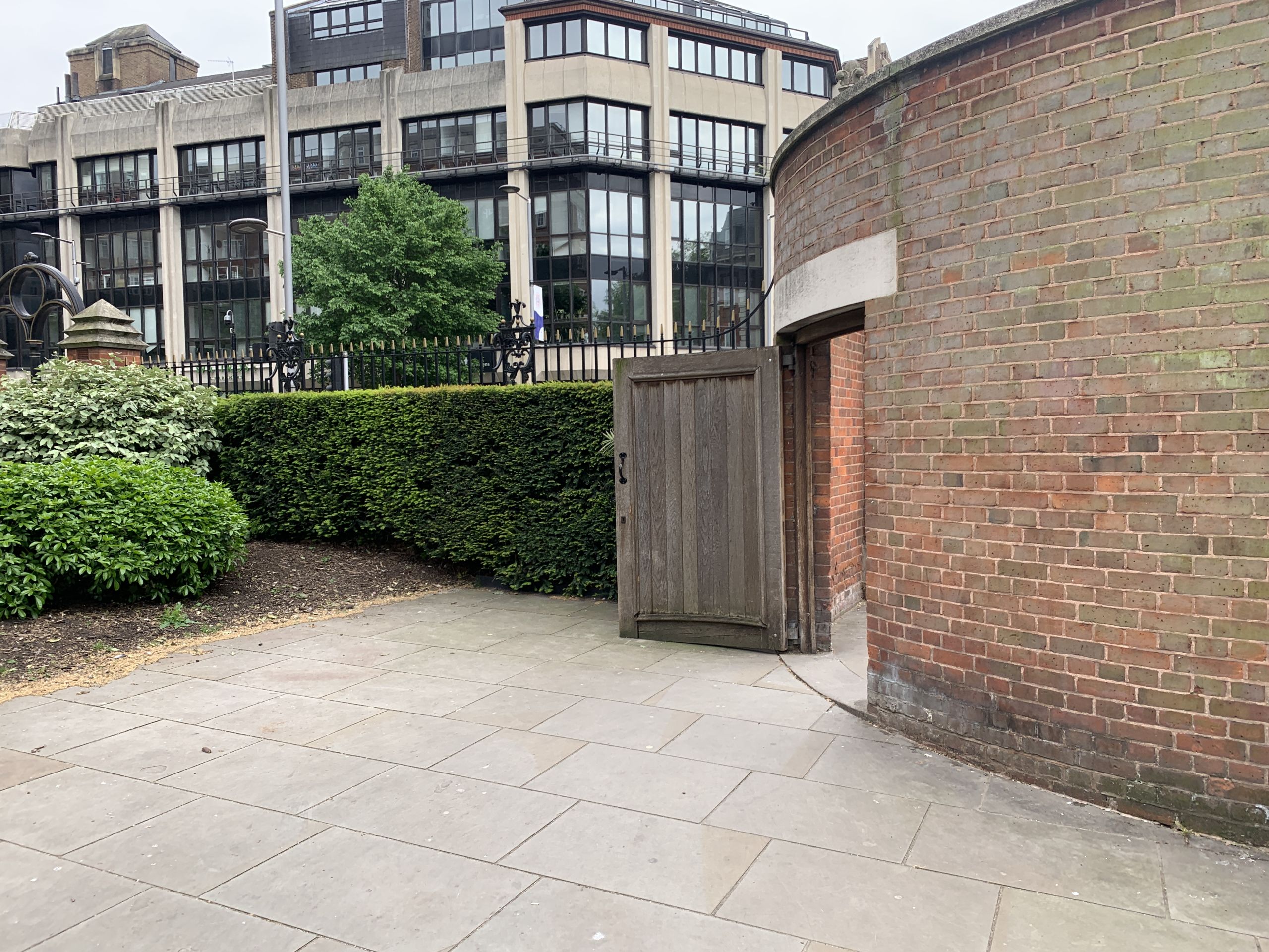
A mighty entryway:

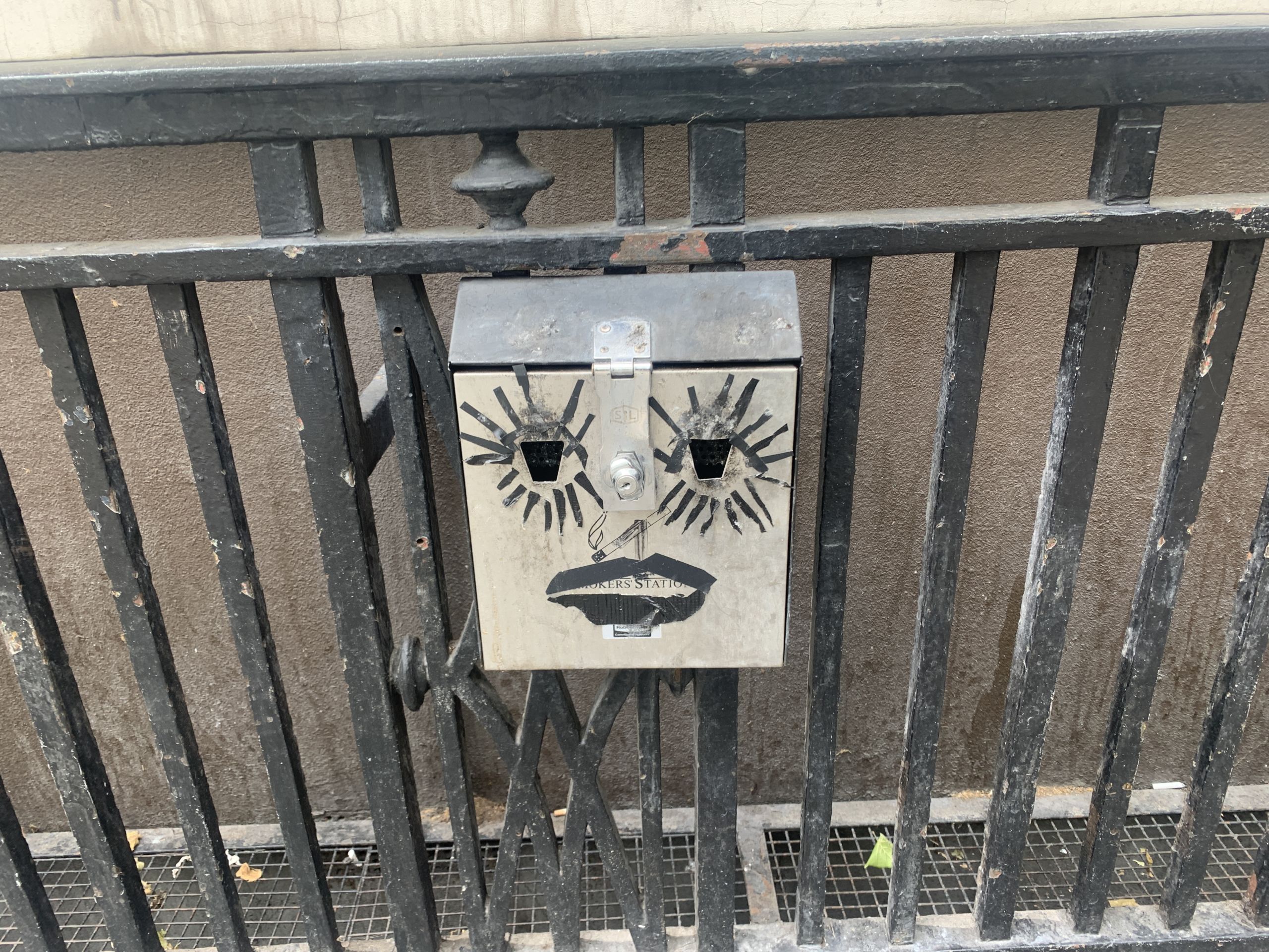
A lovely face:
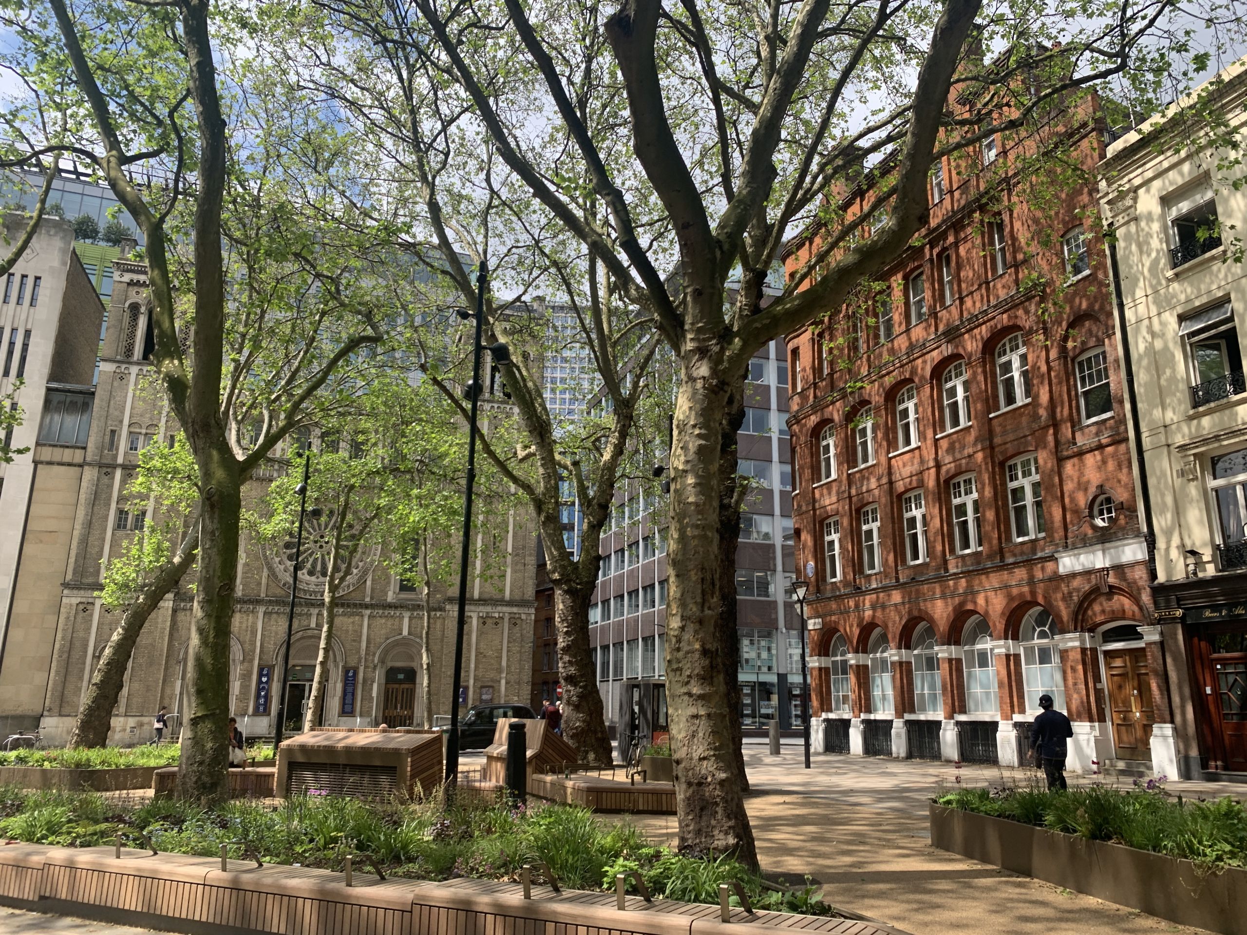
Trees and bricks:
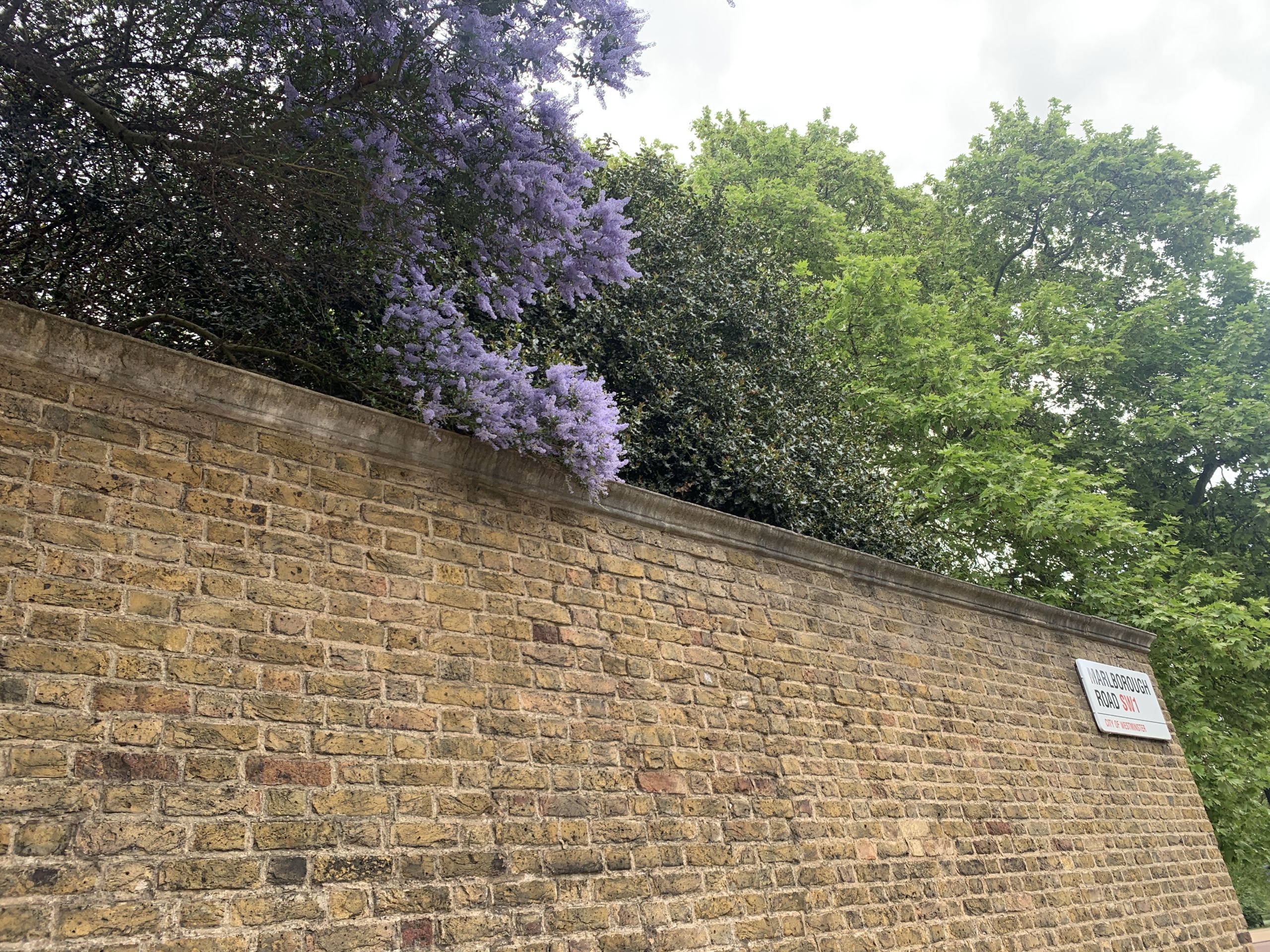
A brick wall:
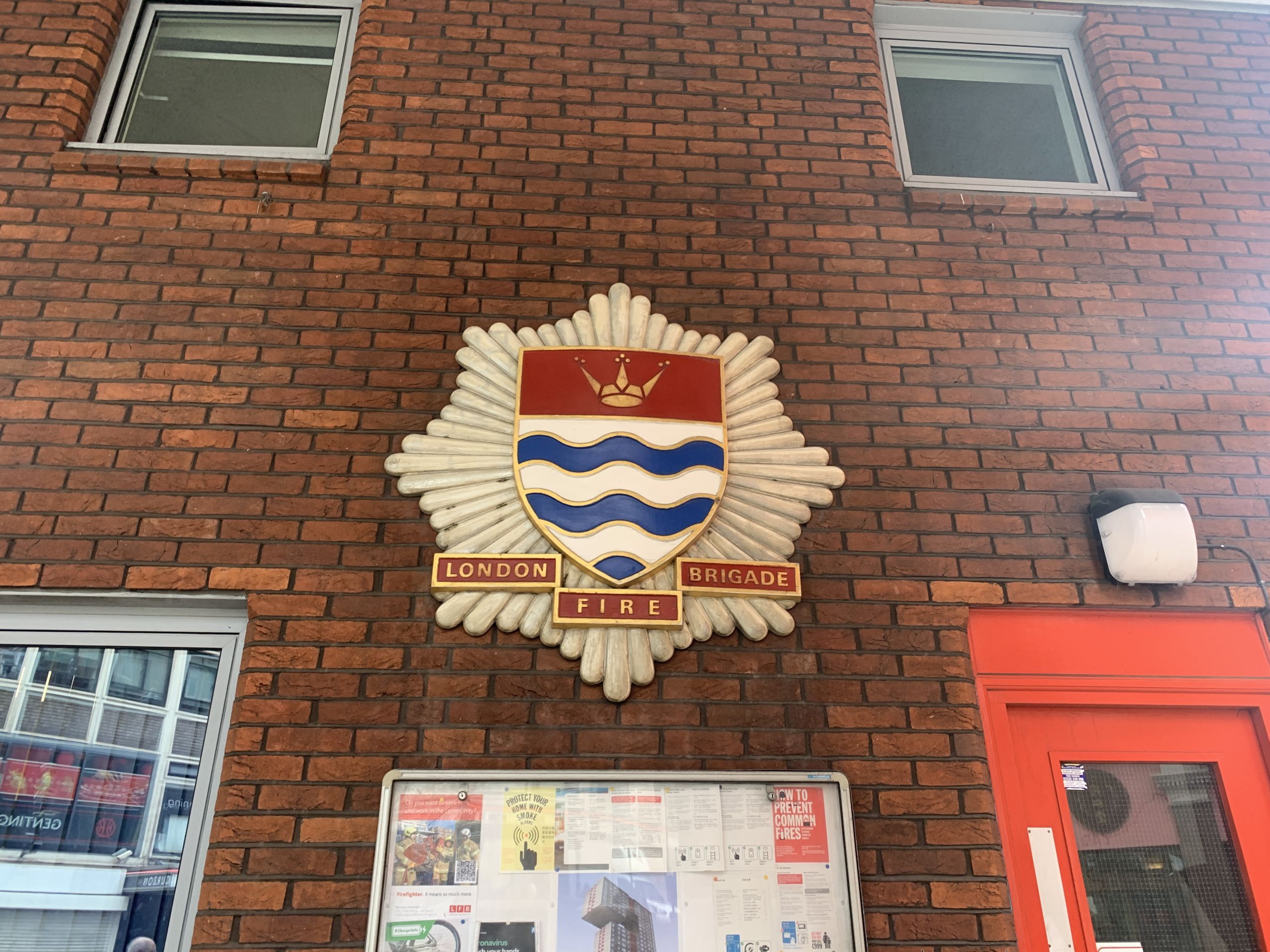
The London Fire Brigade’s coat of arms reminds me of the Kiribati flag 🇰🇮:
Chinatown:

A gallery:
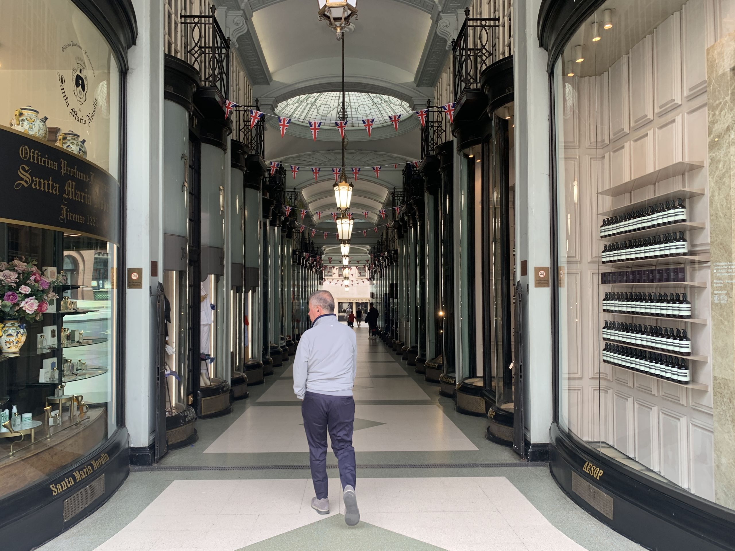
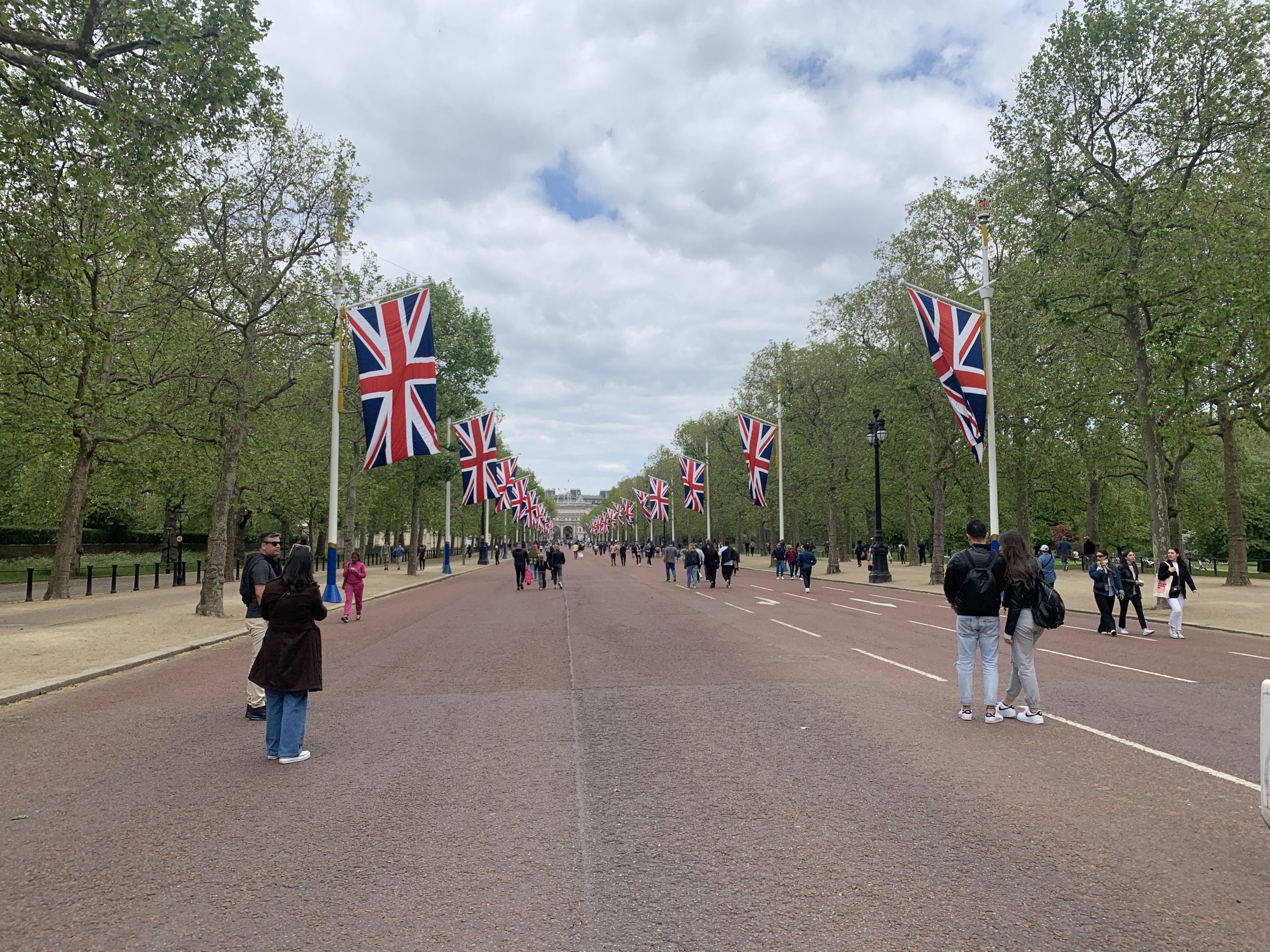
A patriotic flag display:
An ice cream van:

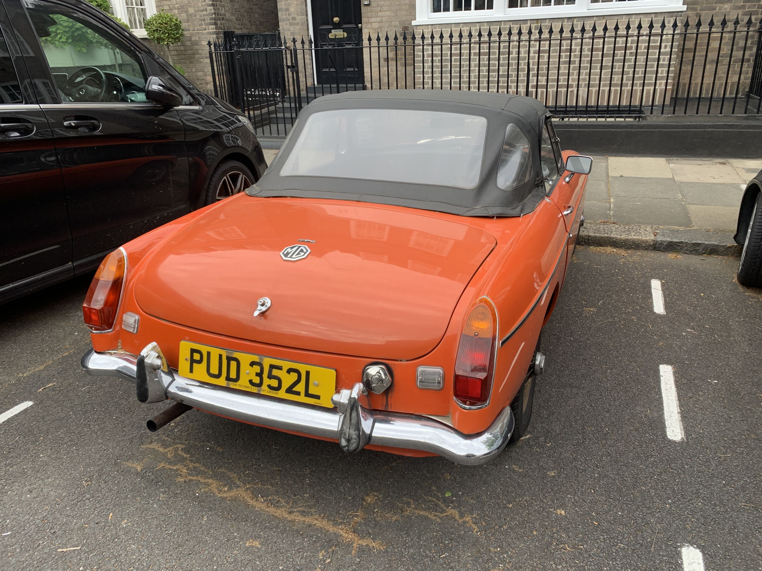
A charming car:
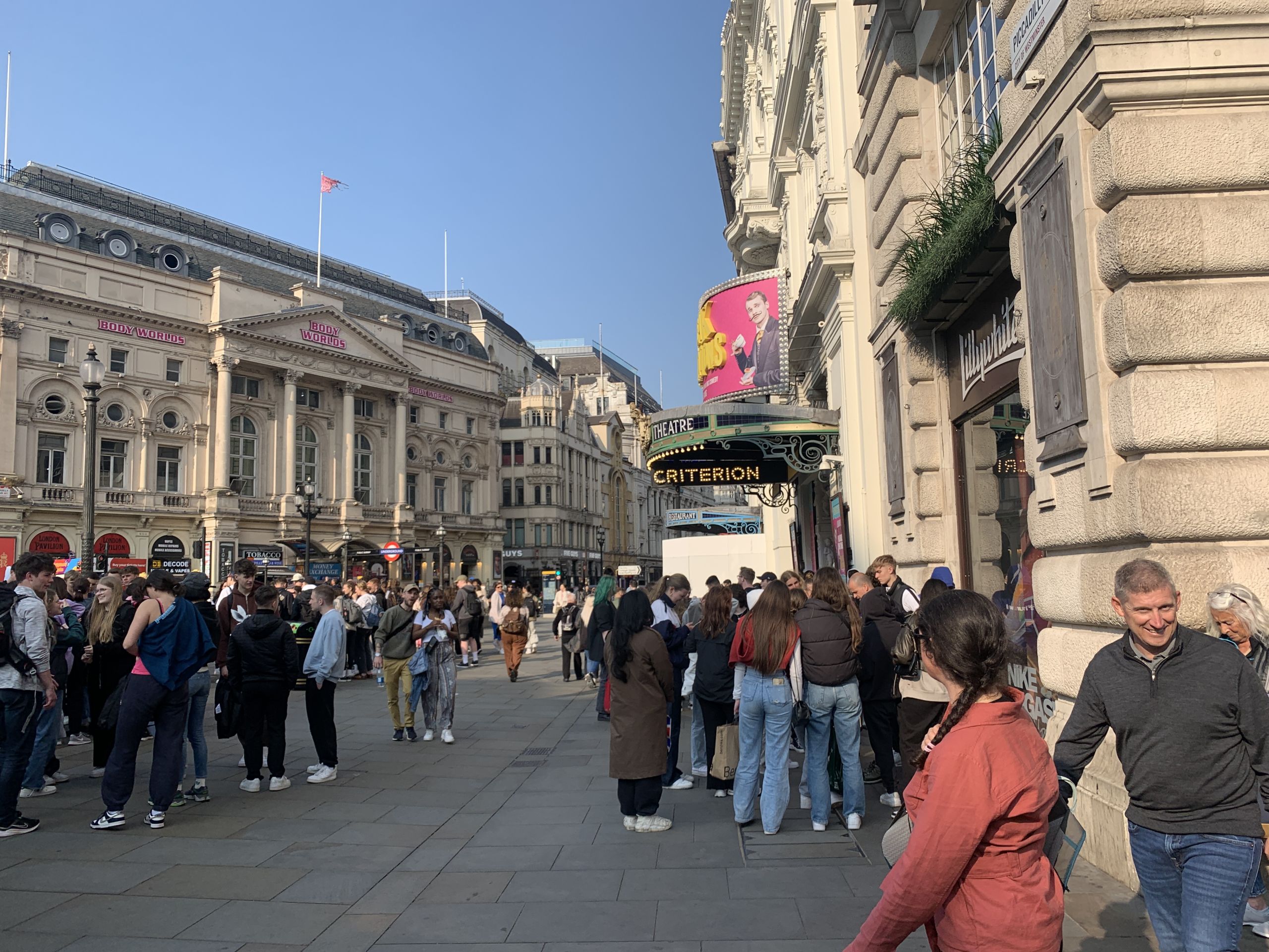
A square:
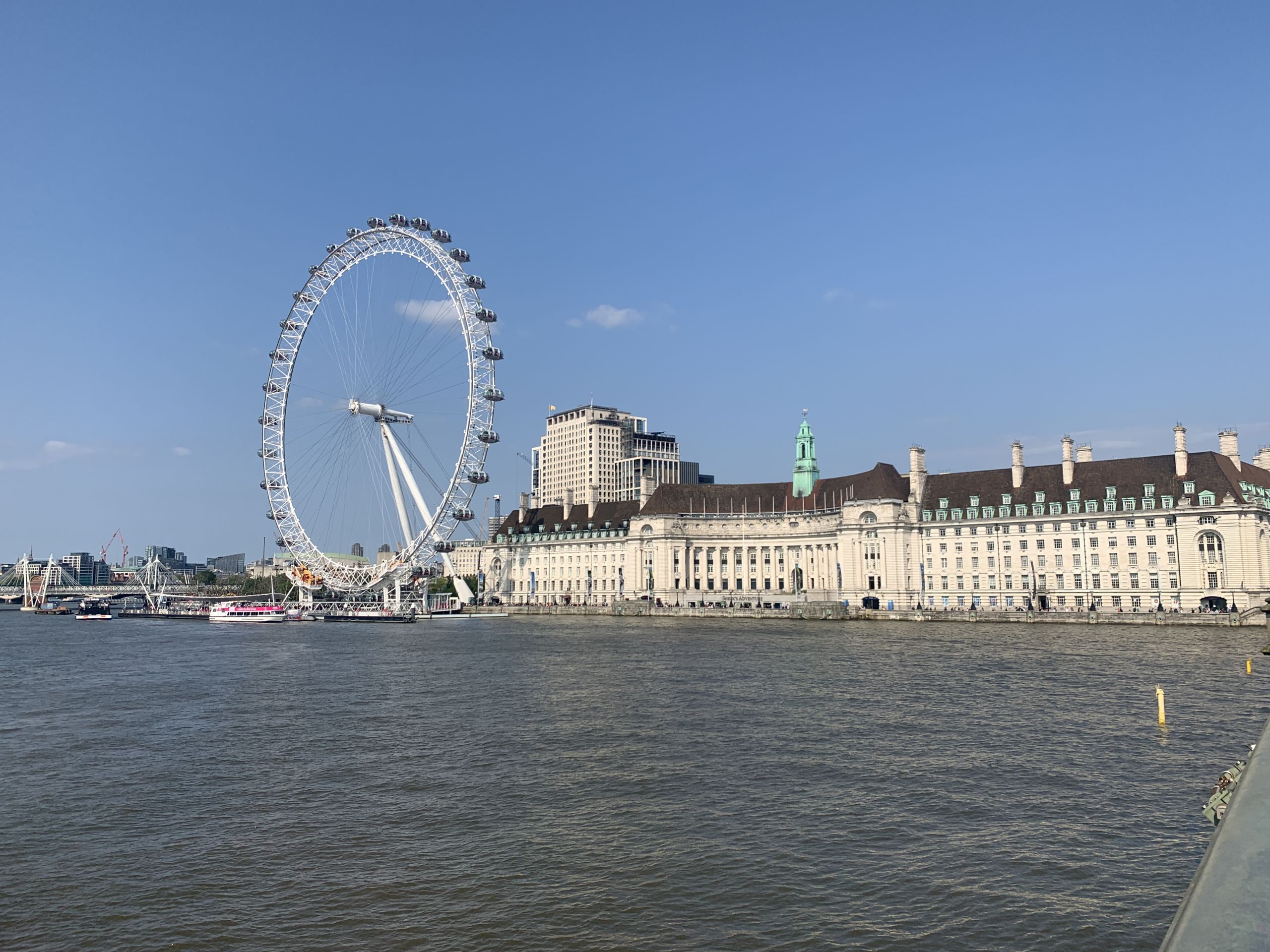
The London Eye:
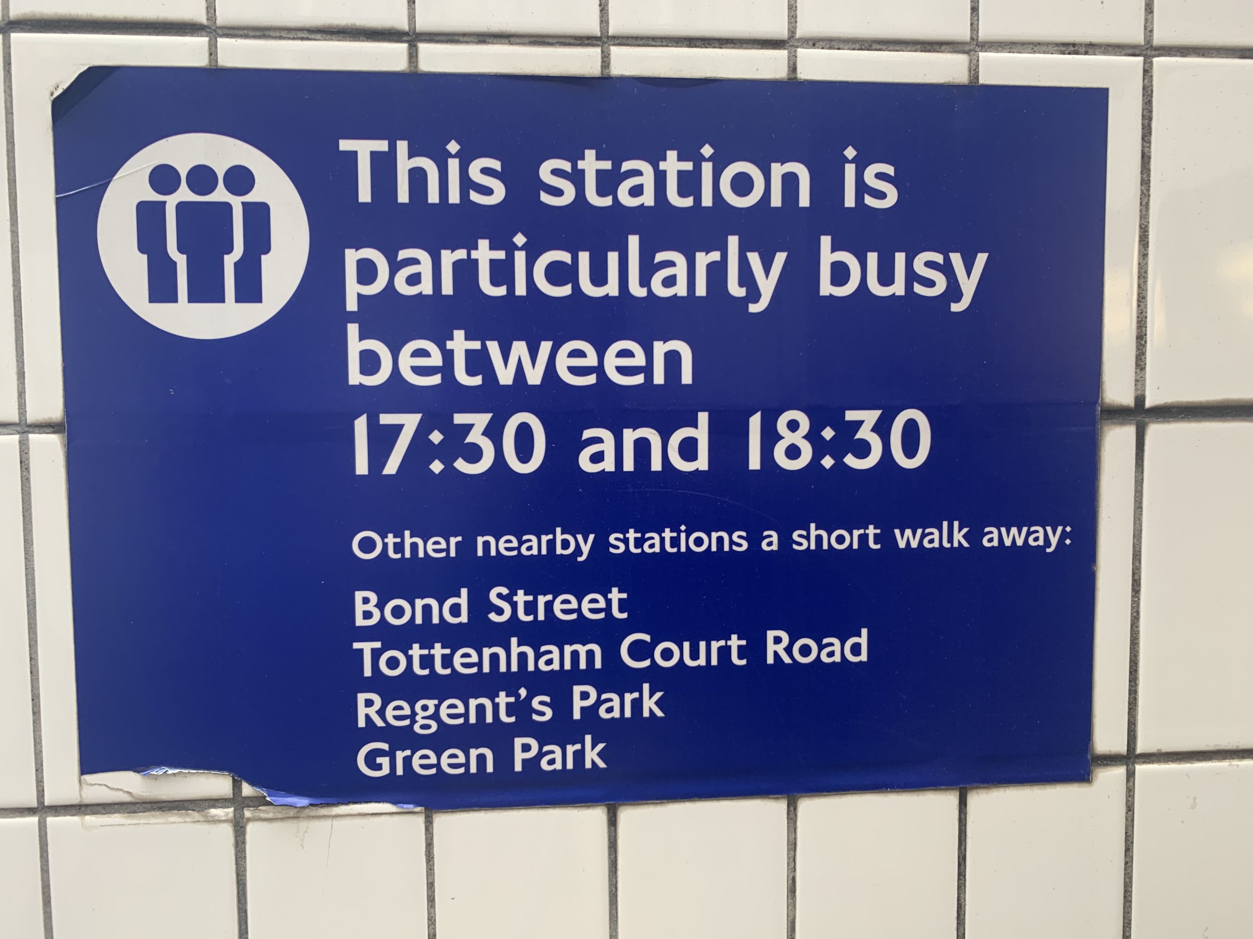
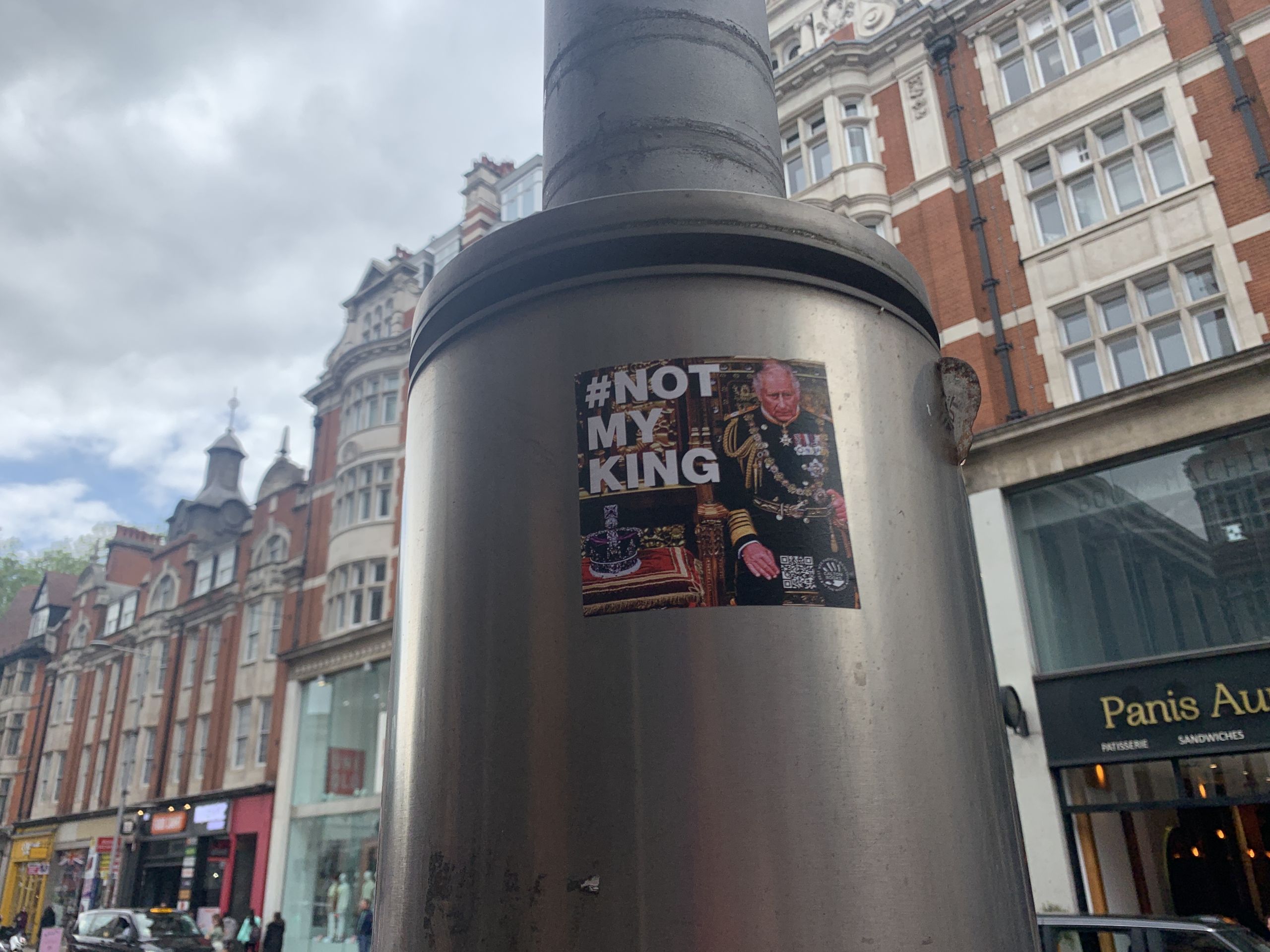
Big Sister is watching:

A pharmacy swastika:

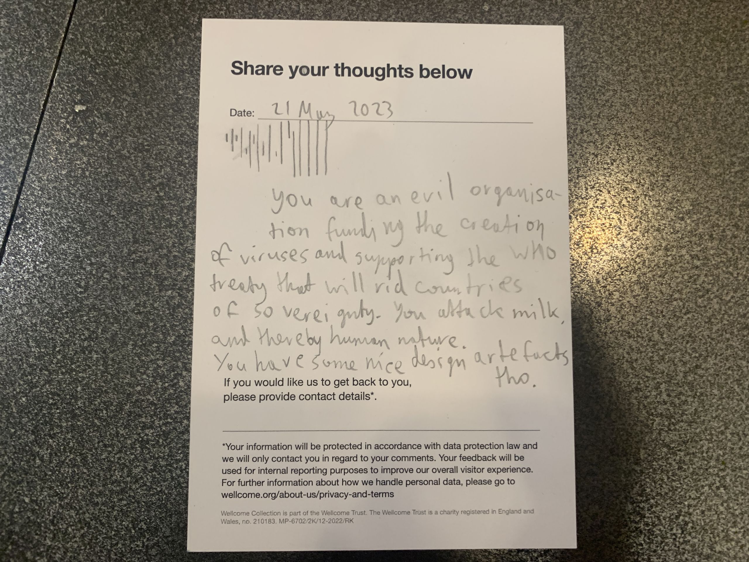
Wokeness at the Wellcome Collection:

My message:
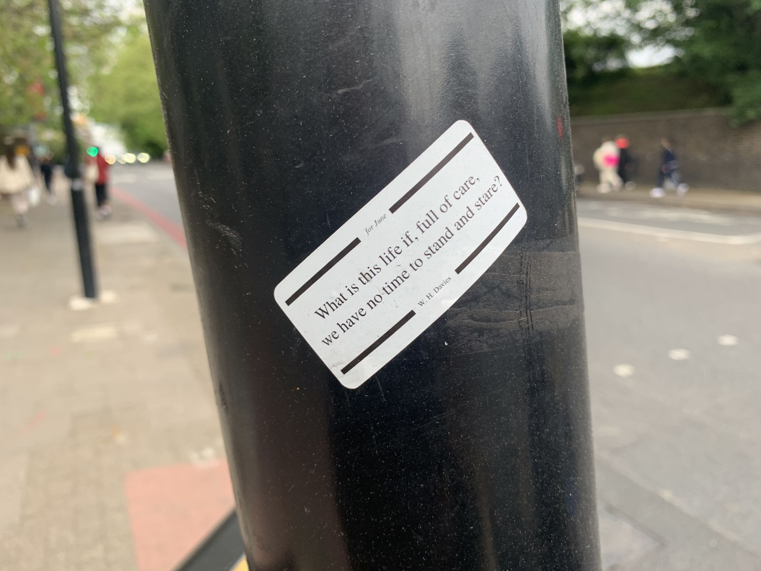
The first words of one of my favorite poëms, Leisure, on a sticker:
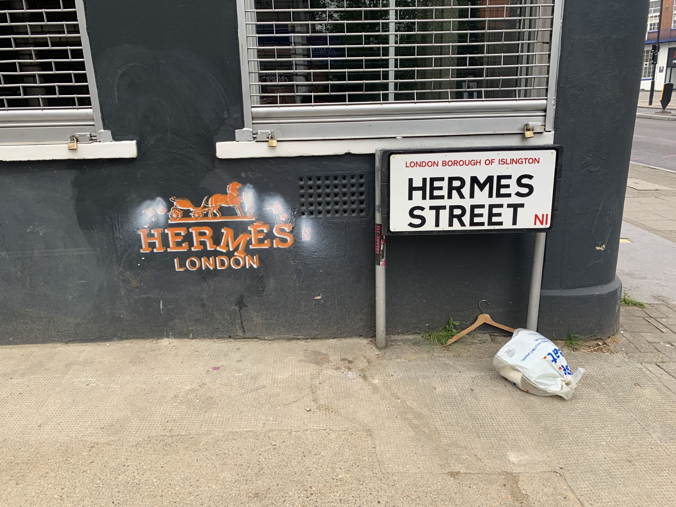
Other city details:
Unlike Italy, there is a lot of Asian and Indian cuisine in London. Its spicy aromas are a delight.
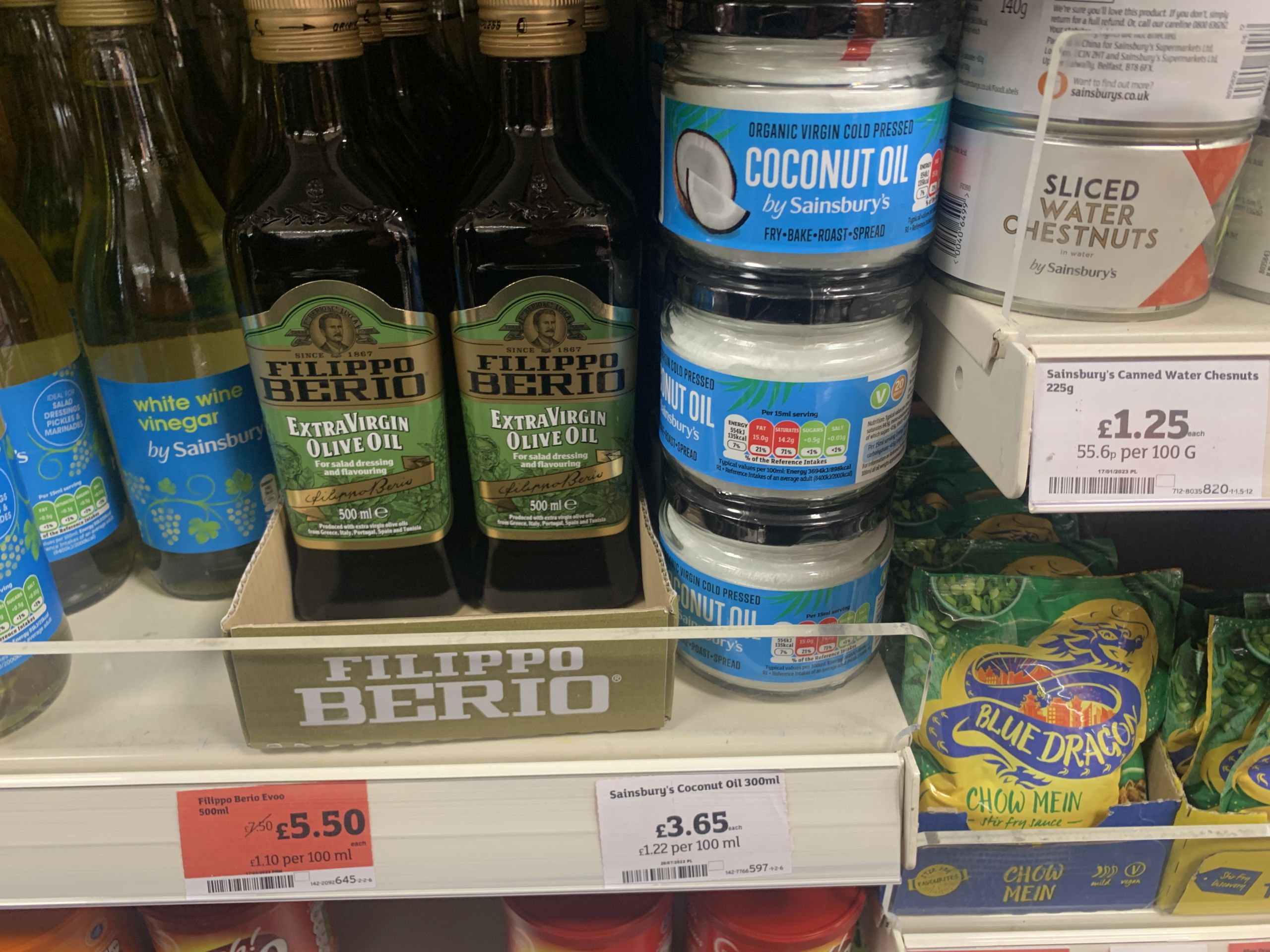
Packaging at the supermarket:
Drinking from a coconut:

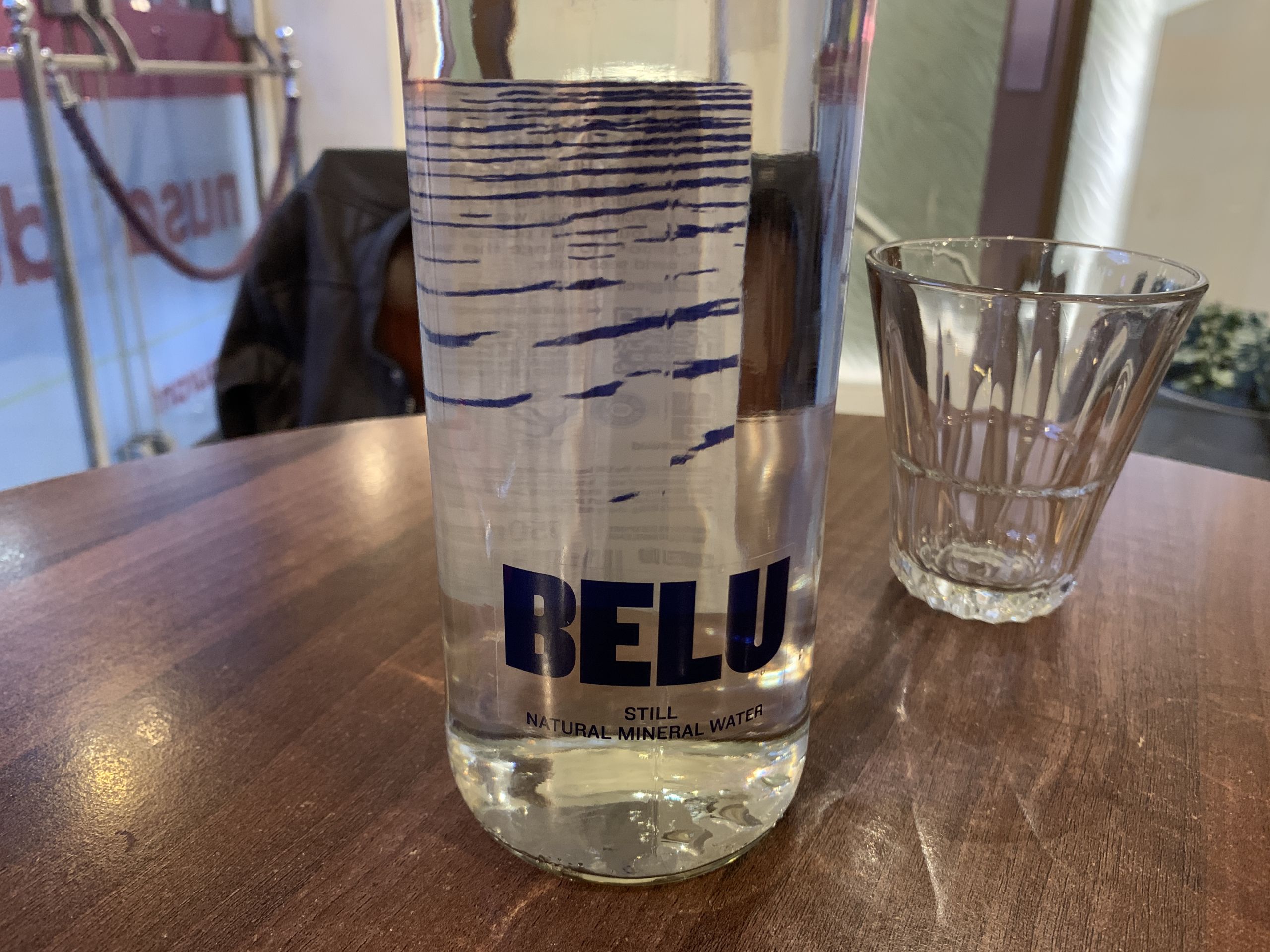
A water bottle:
Swedenborg’s Rules of Tremulation:

It’s a shame Selfridges doesn’t sell fridges.
Play now. Win later¹
¹A lot later. Possibly never
Mass sadism.
Why the hell are The Times paying for an anti-Assange advertisement? And when did child-free feminist nonsense become more important than life, style, and puzzles?

Corporate media is morally bankrupt.